

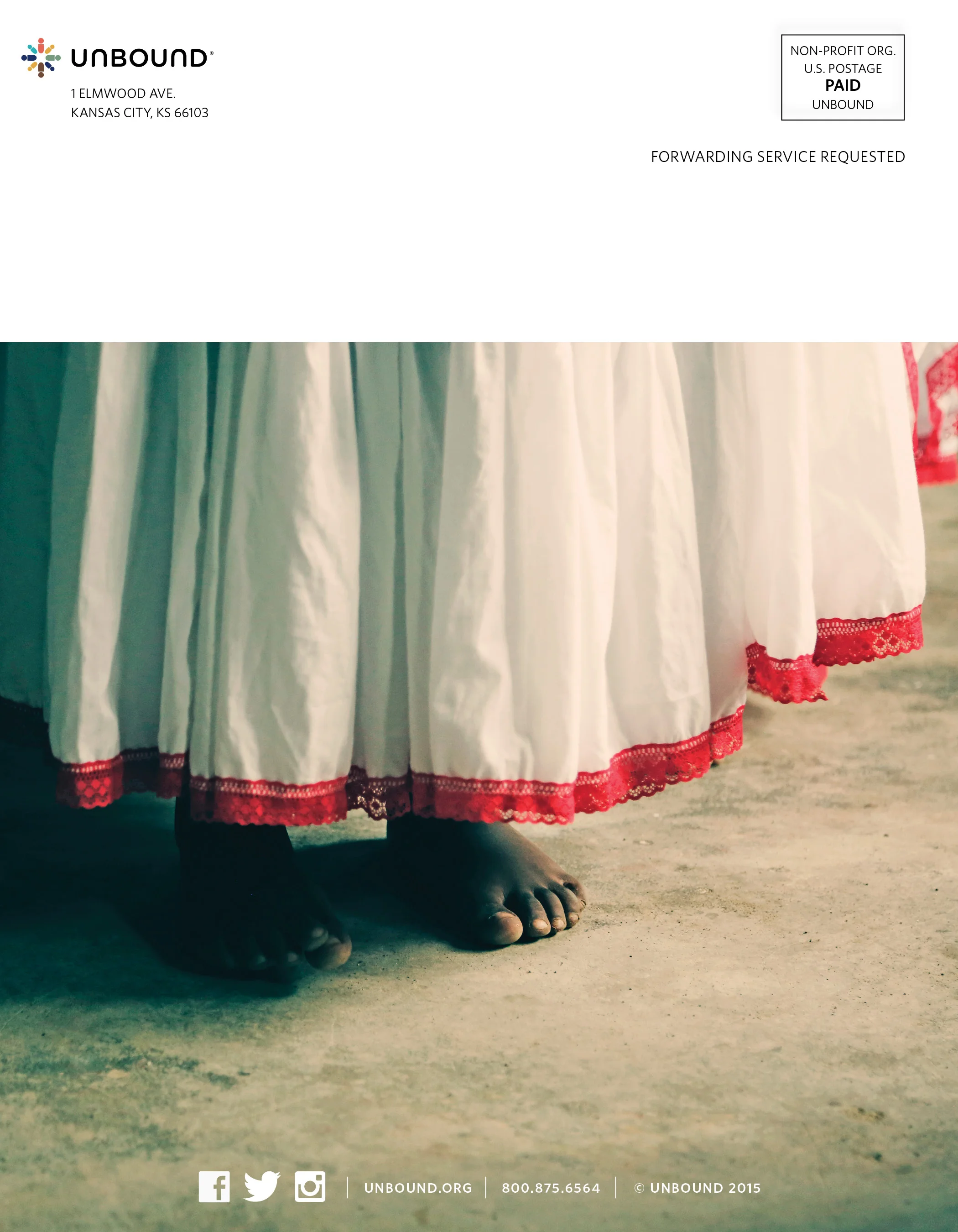


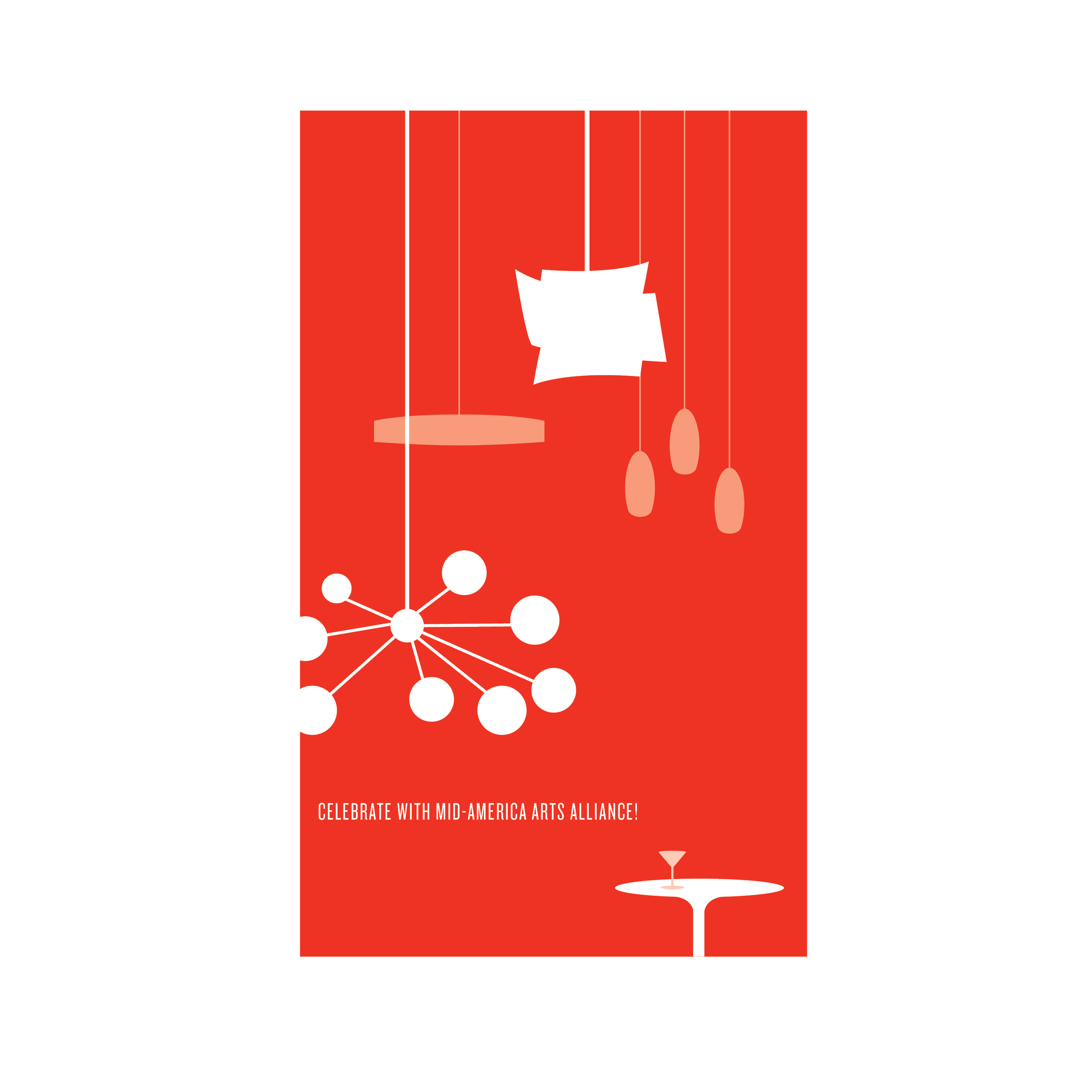
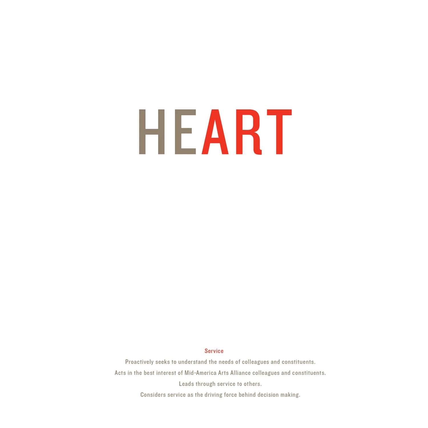
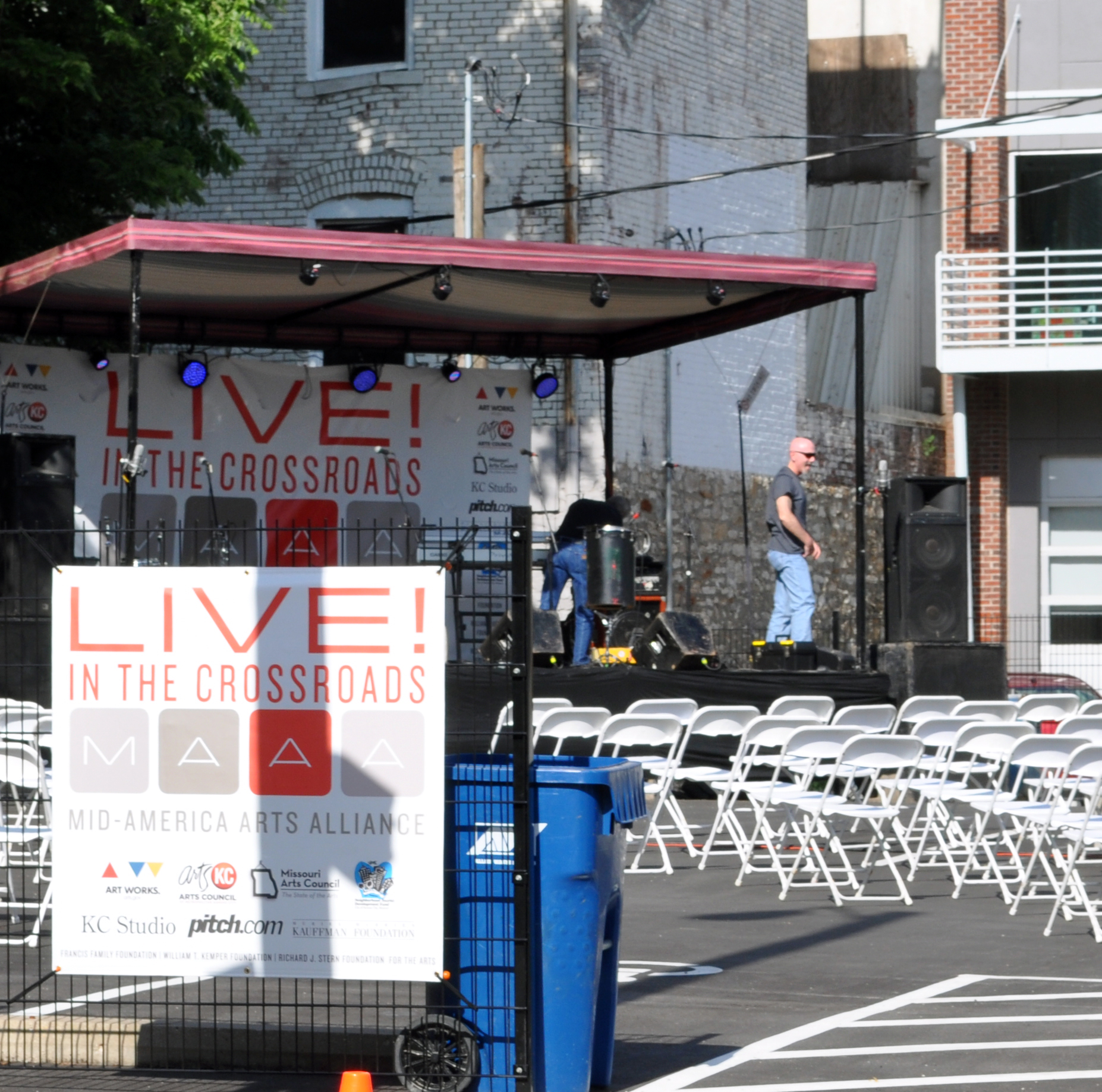
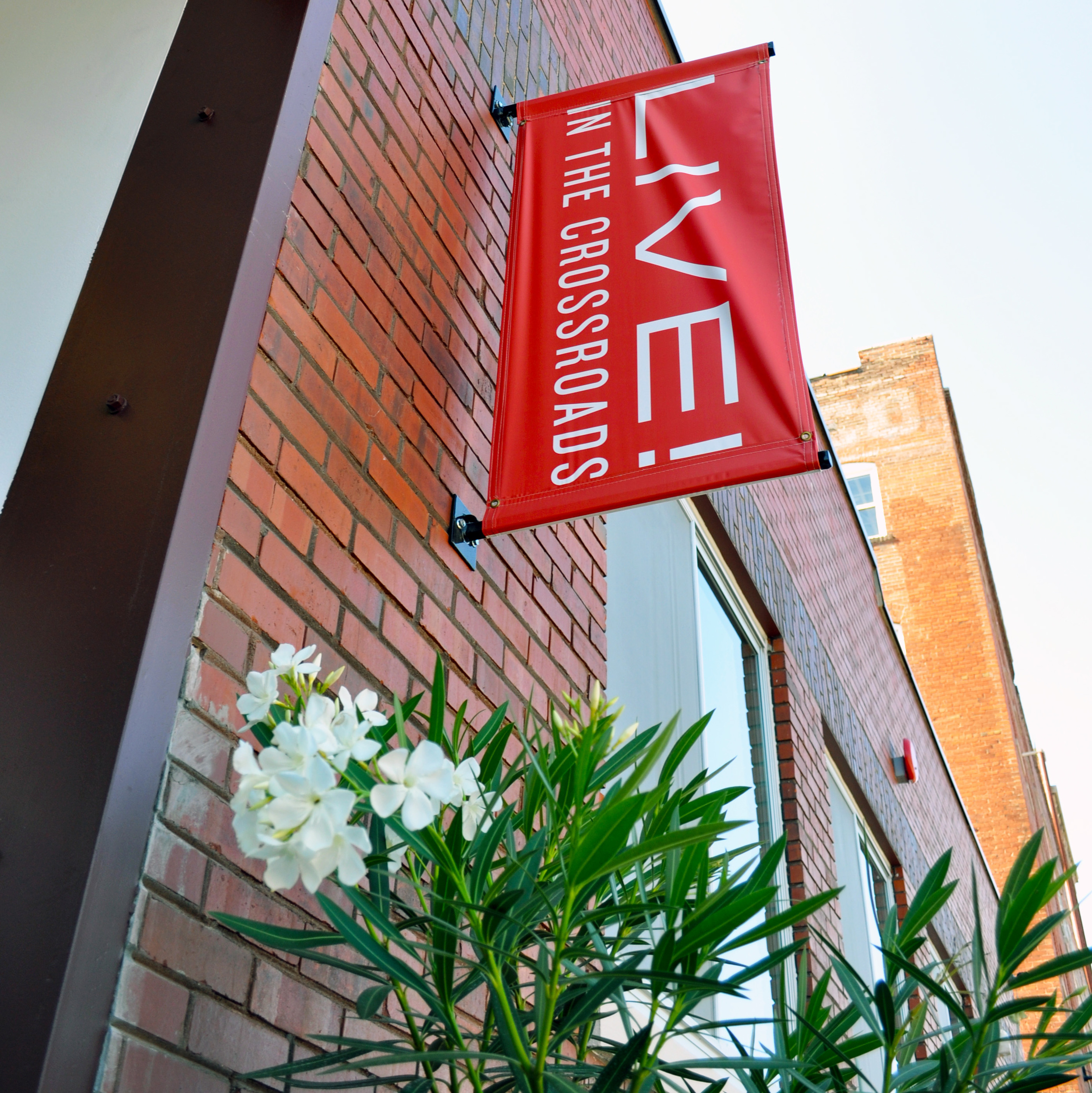
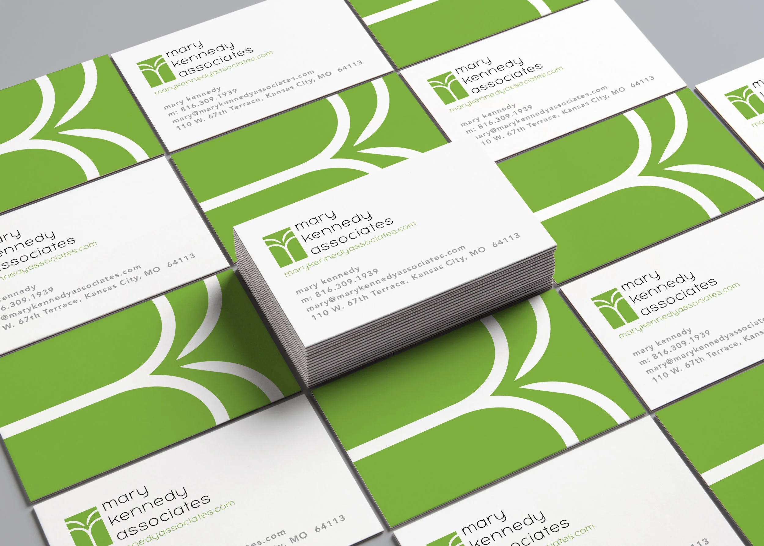
Part of Mid-America Arts Alliance's rebrand in 2013.
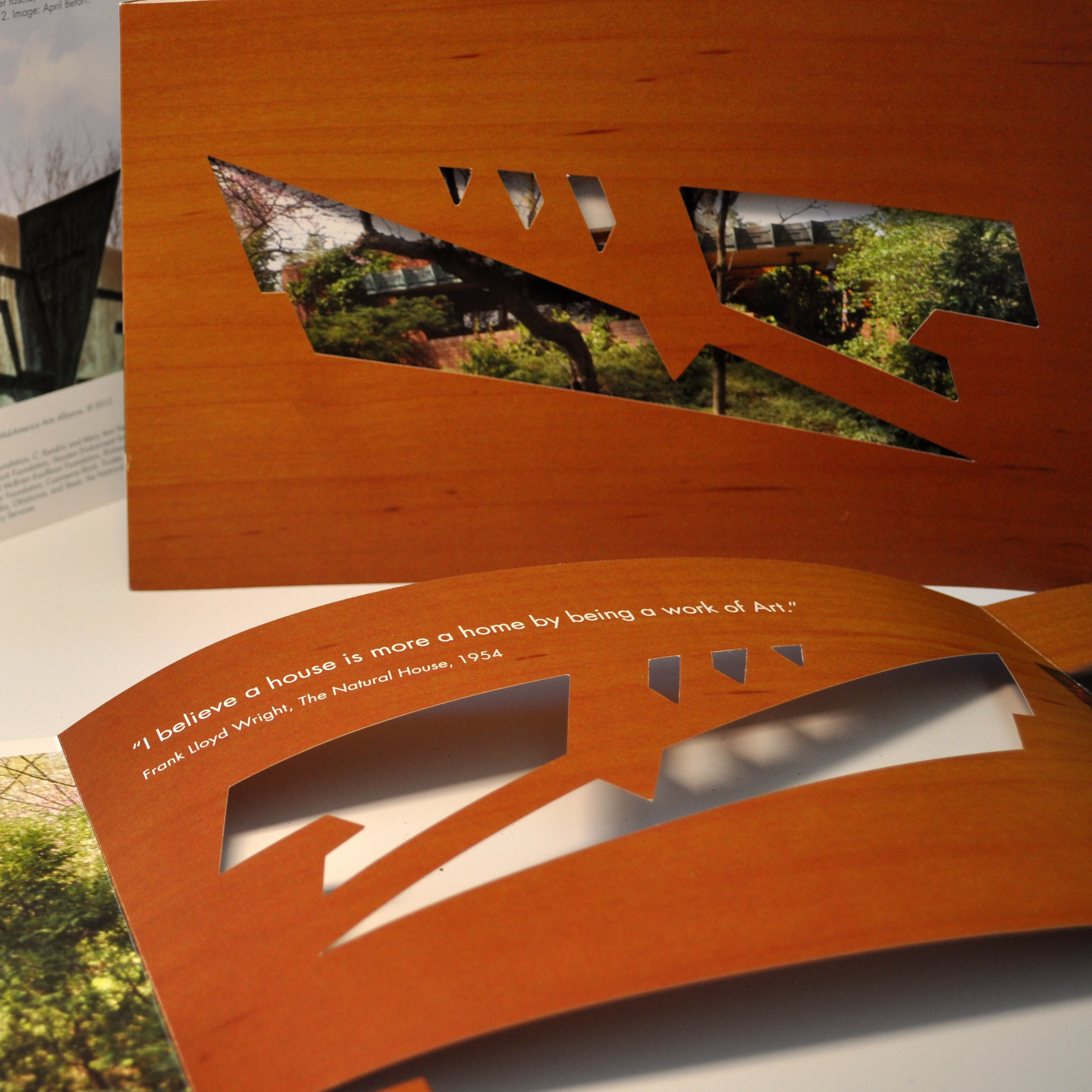
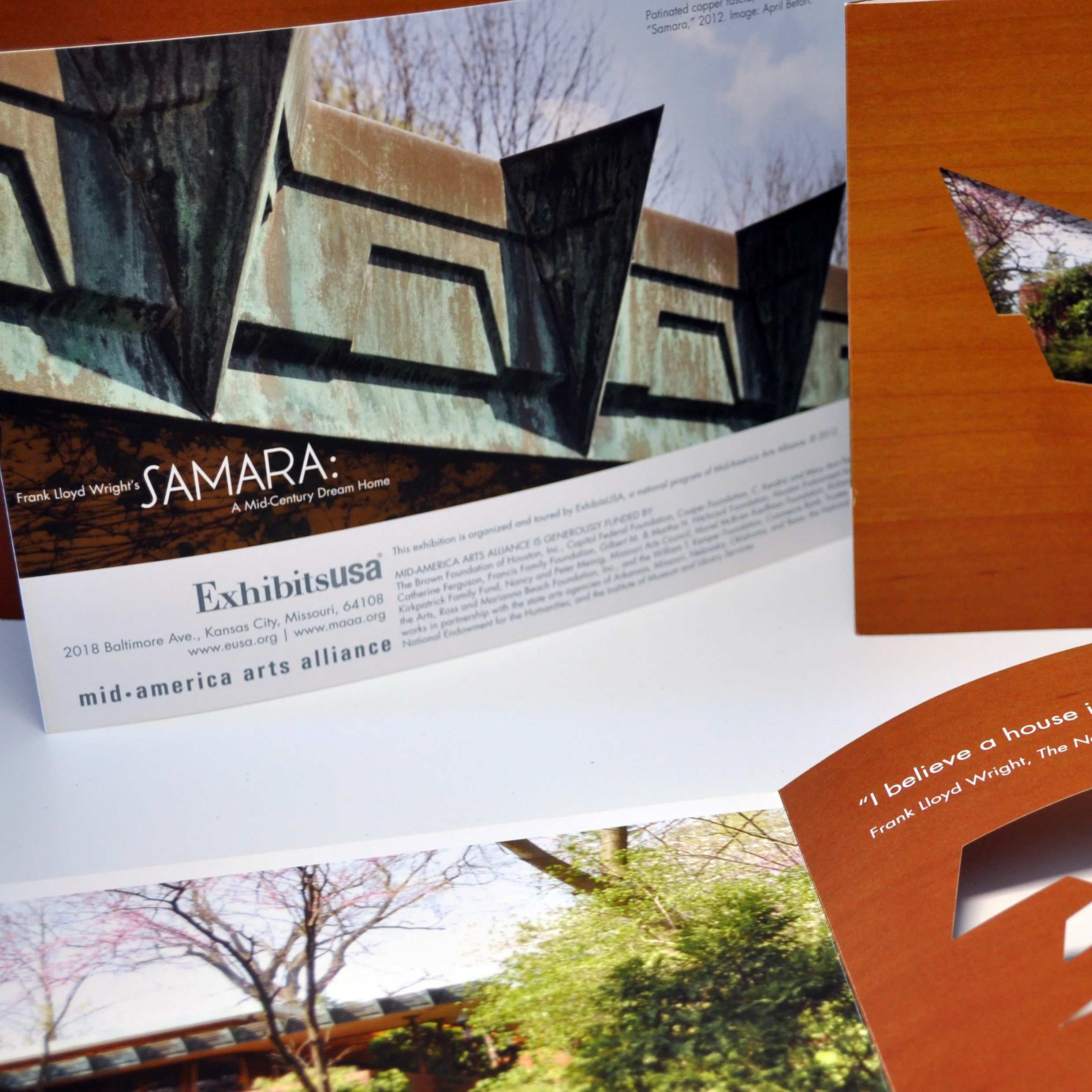
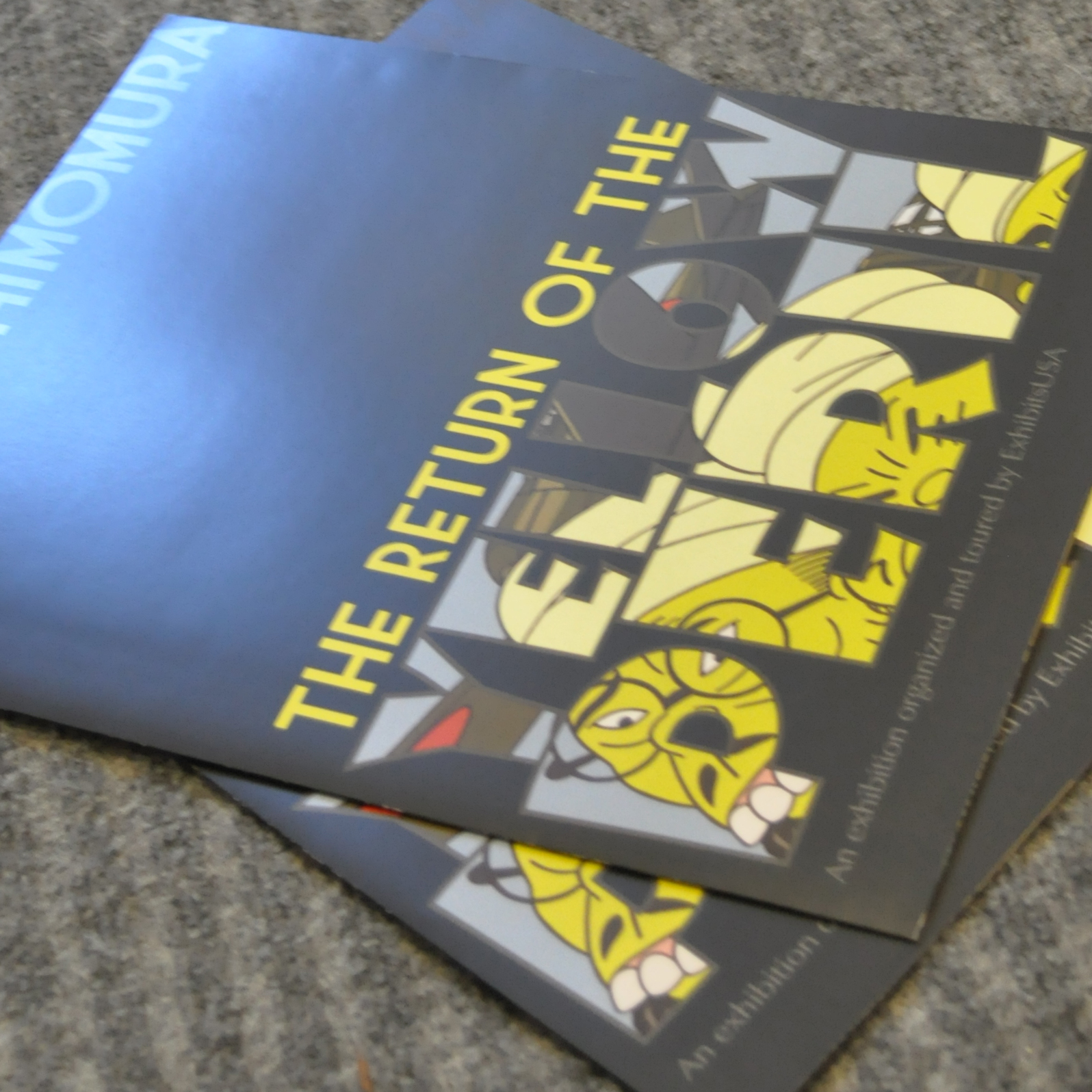
Custom dye cut, smooth touch aqueous coating.
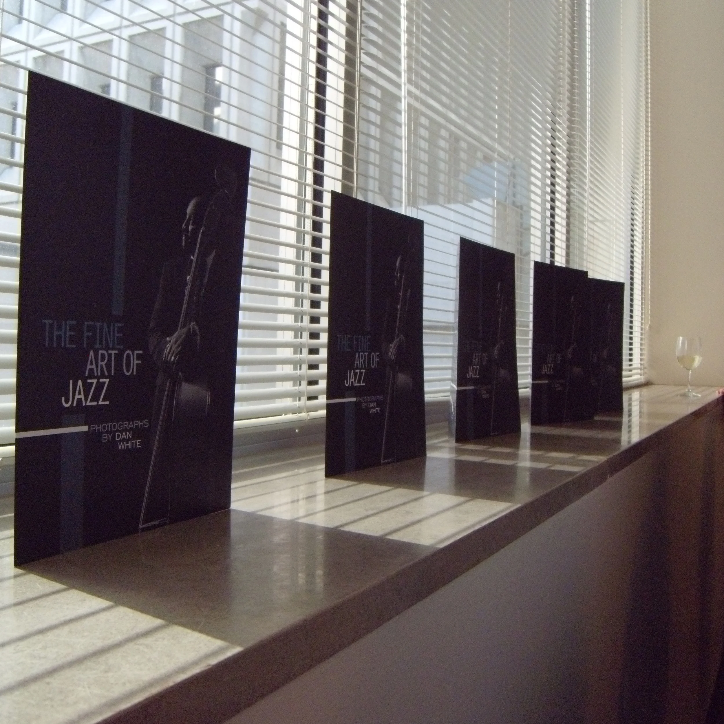
I was the photographer for this exhibition as well as art director.
Animated short.
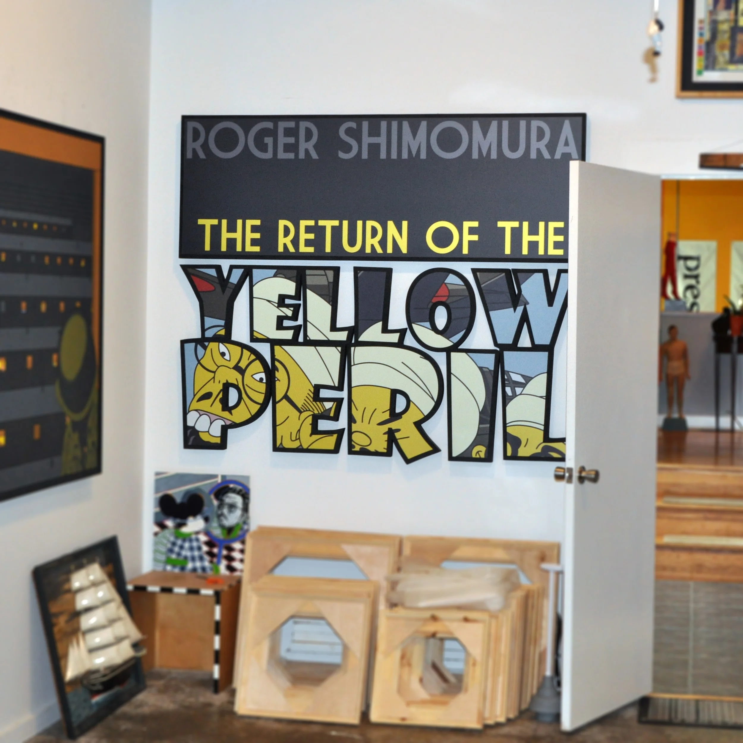
Roger loved the design so much that he collected custom signage from venues once the exhibition finished.
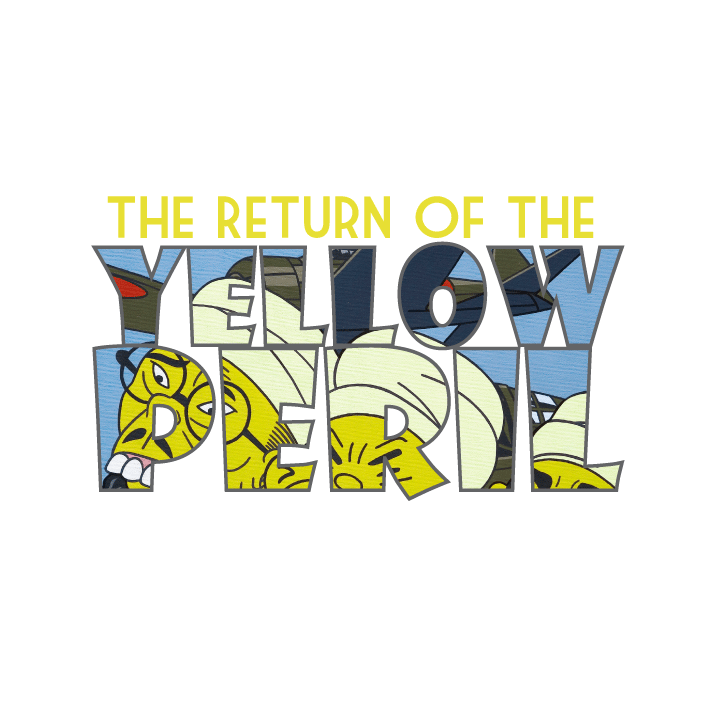
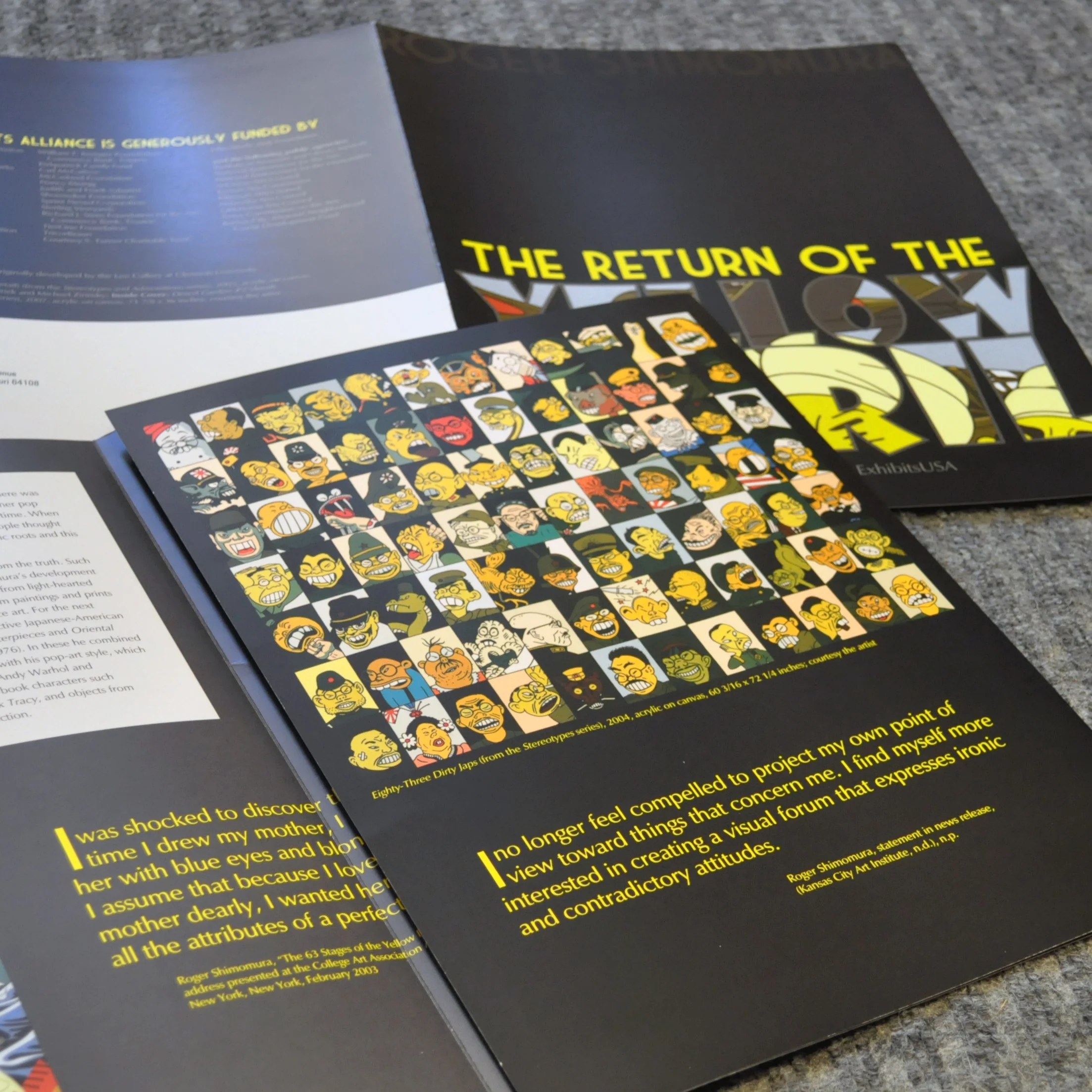
Traveling exhibition for Roger Shimomura. He commented, "I usually do not let designers crop or otherwise change my work. But this design is so gritty, so nasty, I love it! Please proceed!"
Spot matte aqueous on gloss. with cusom mask for Shimomura's name.
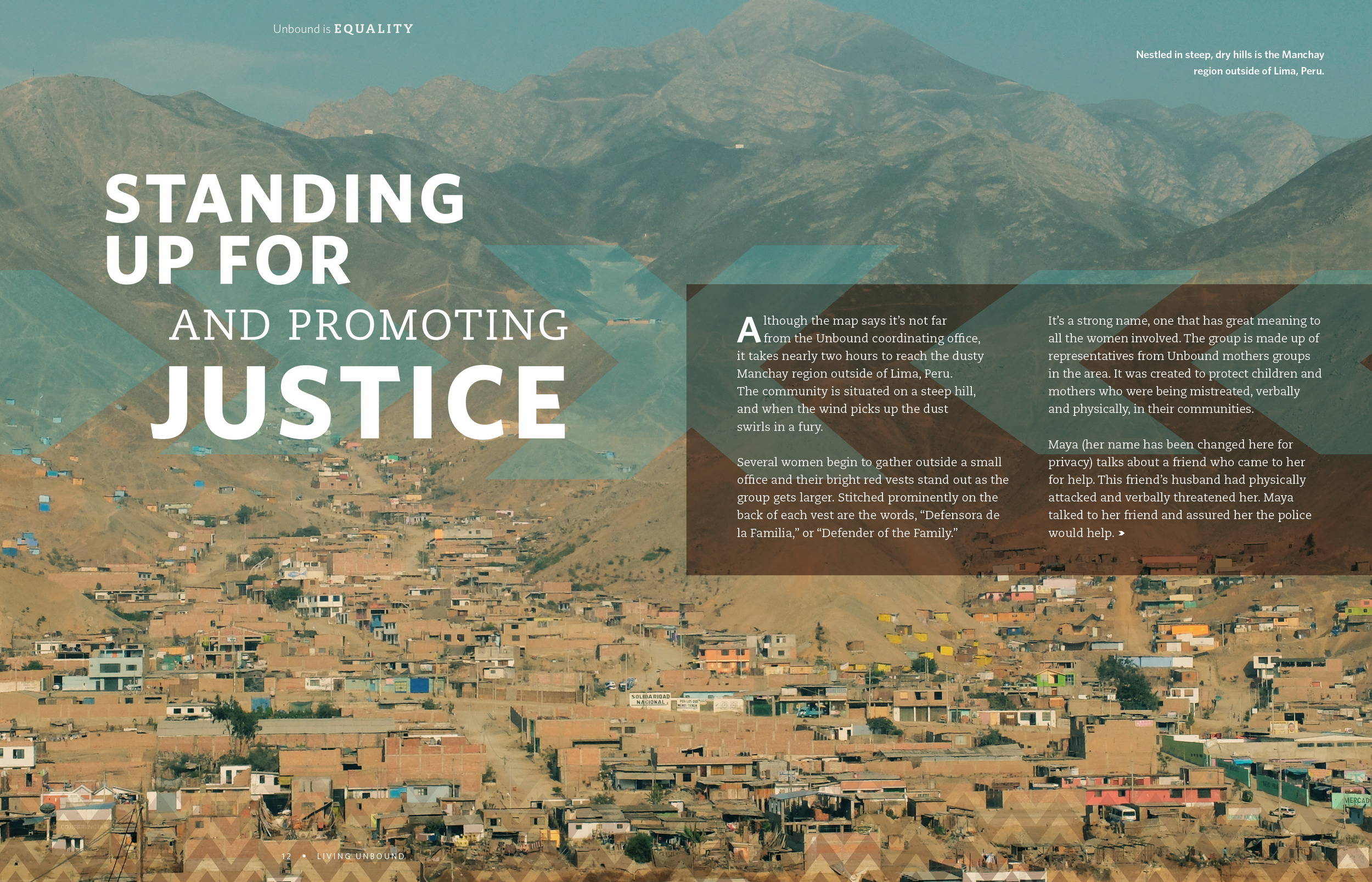
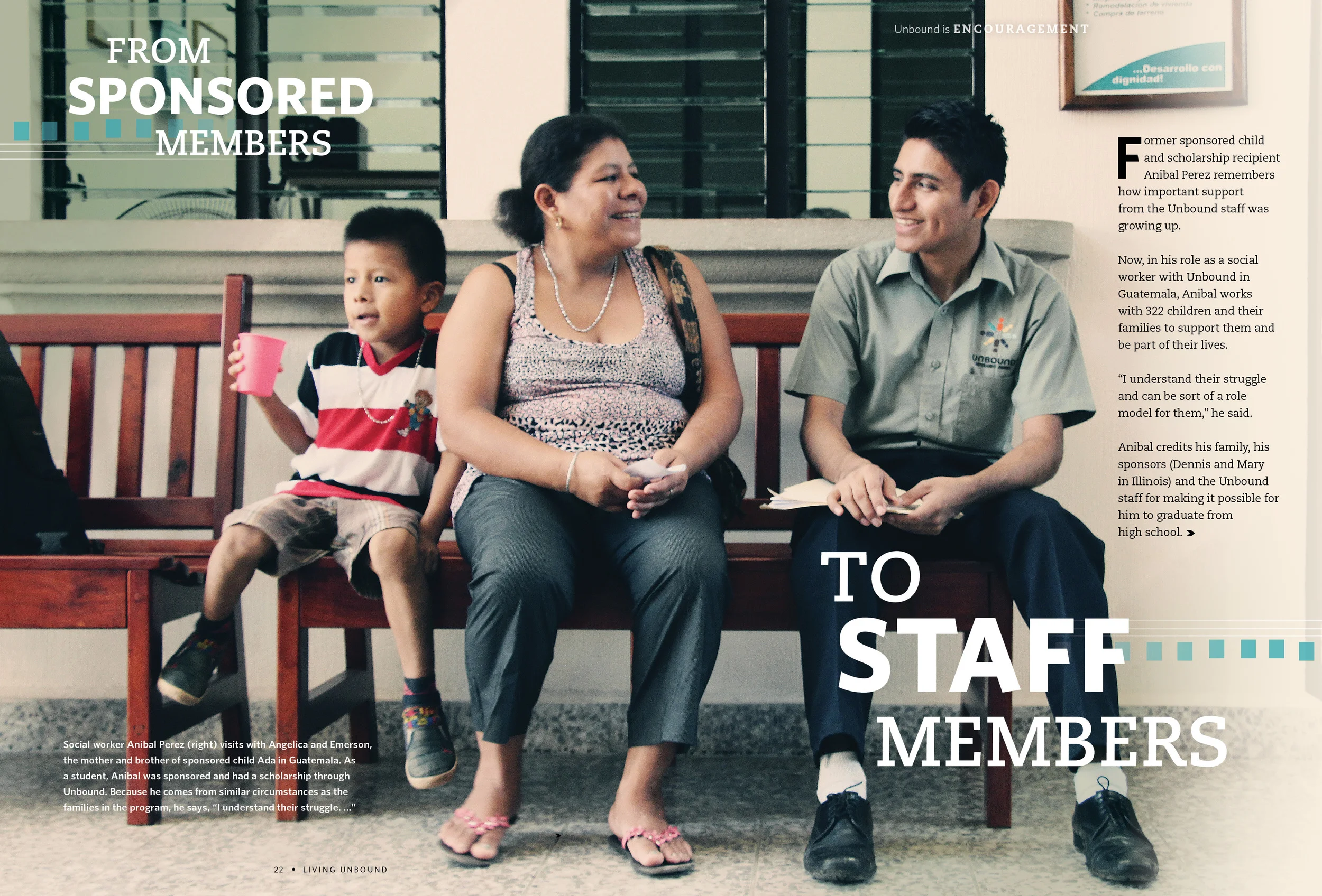
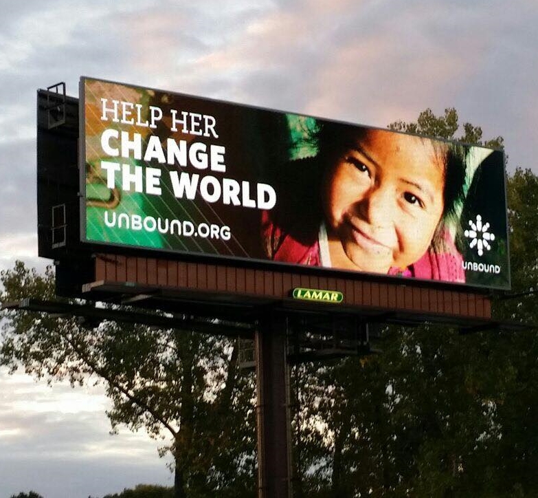
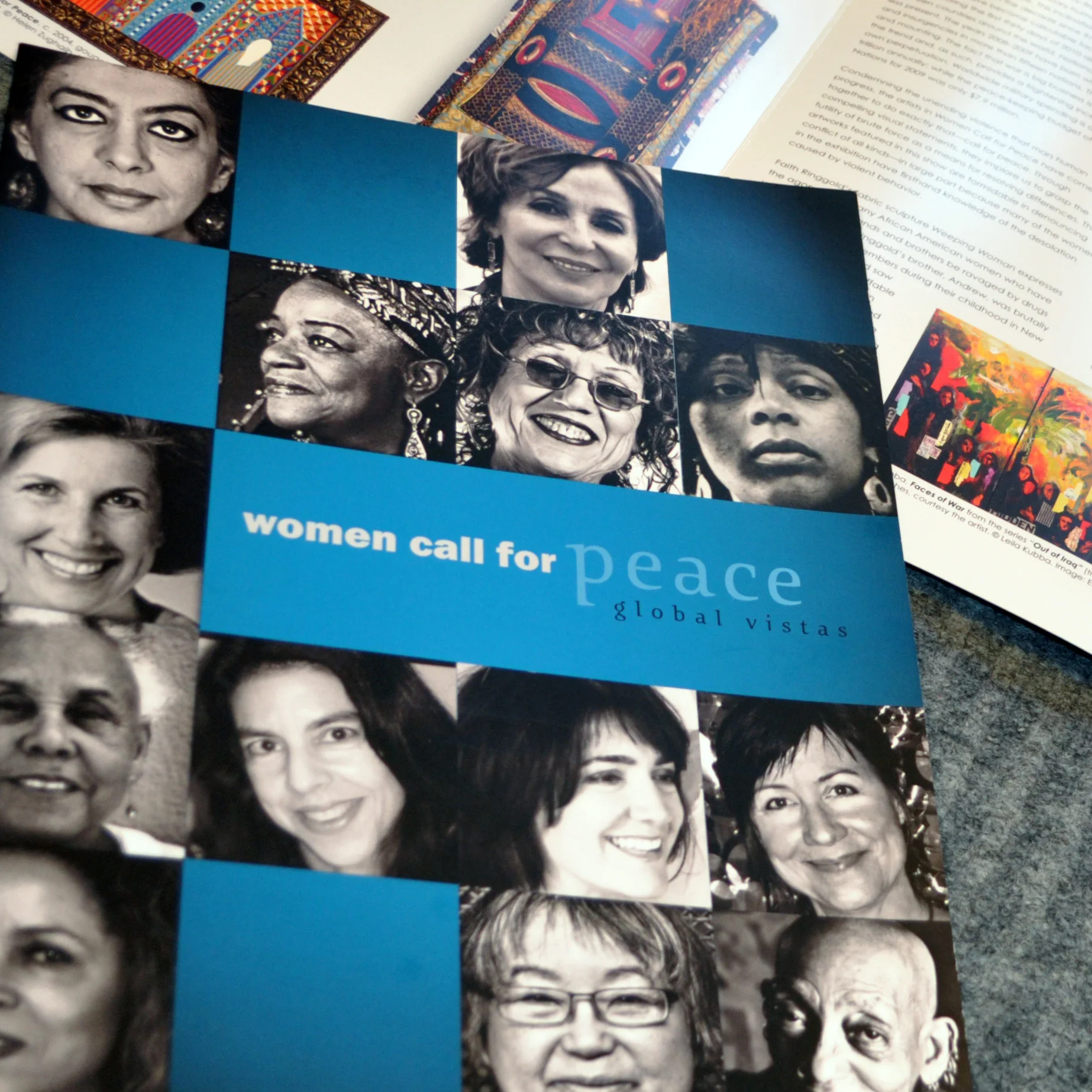
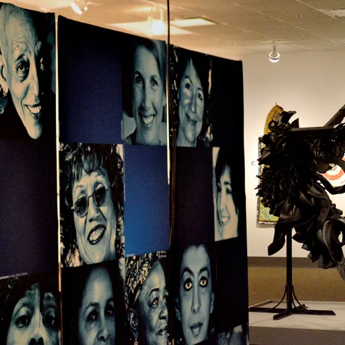
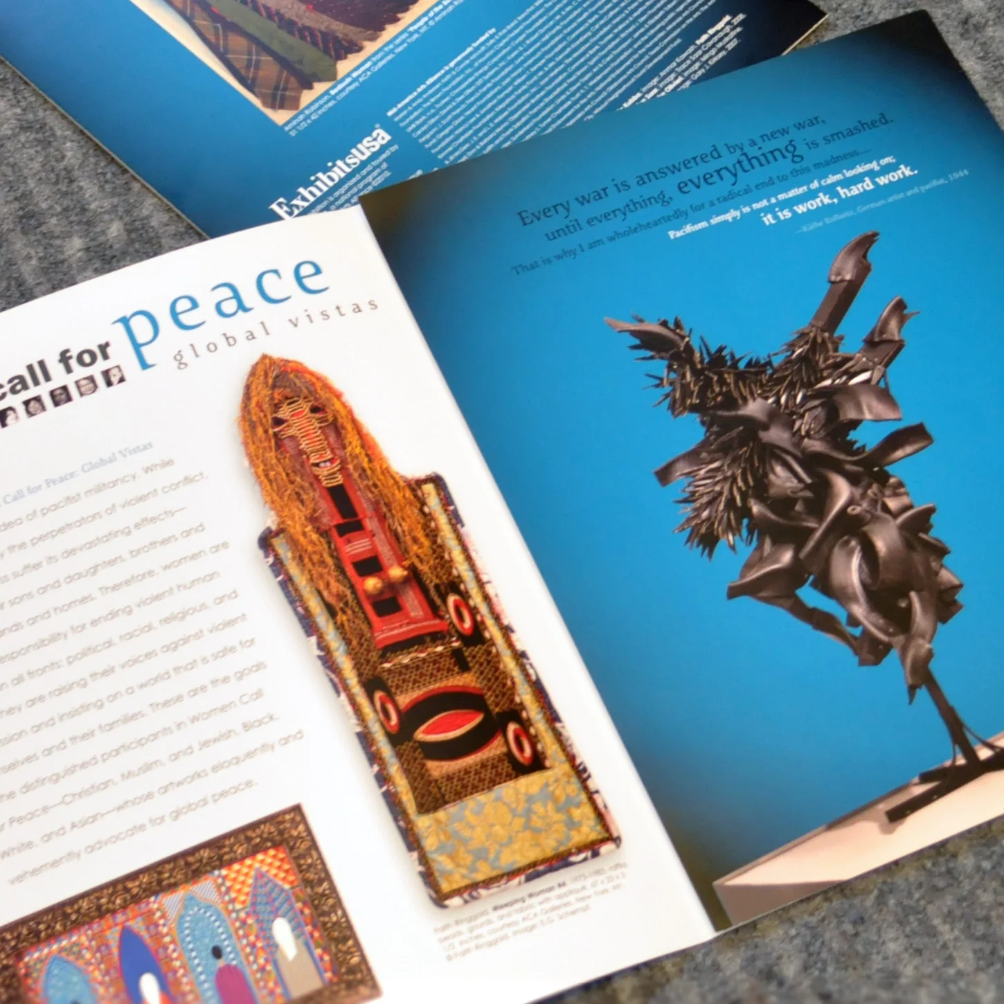
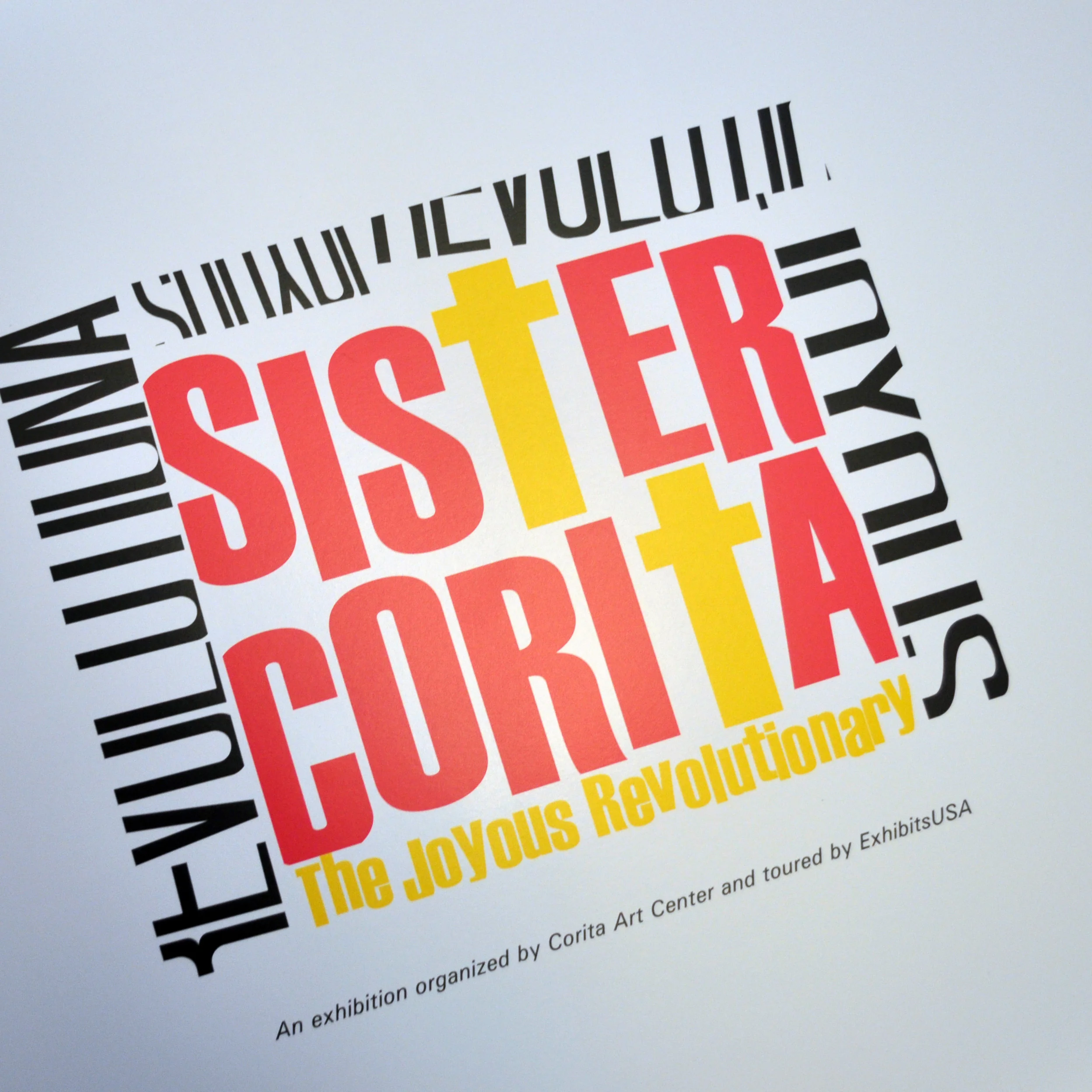
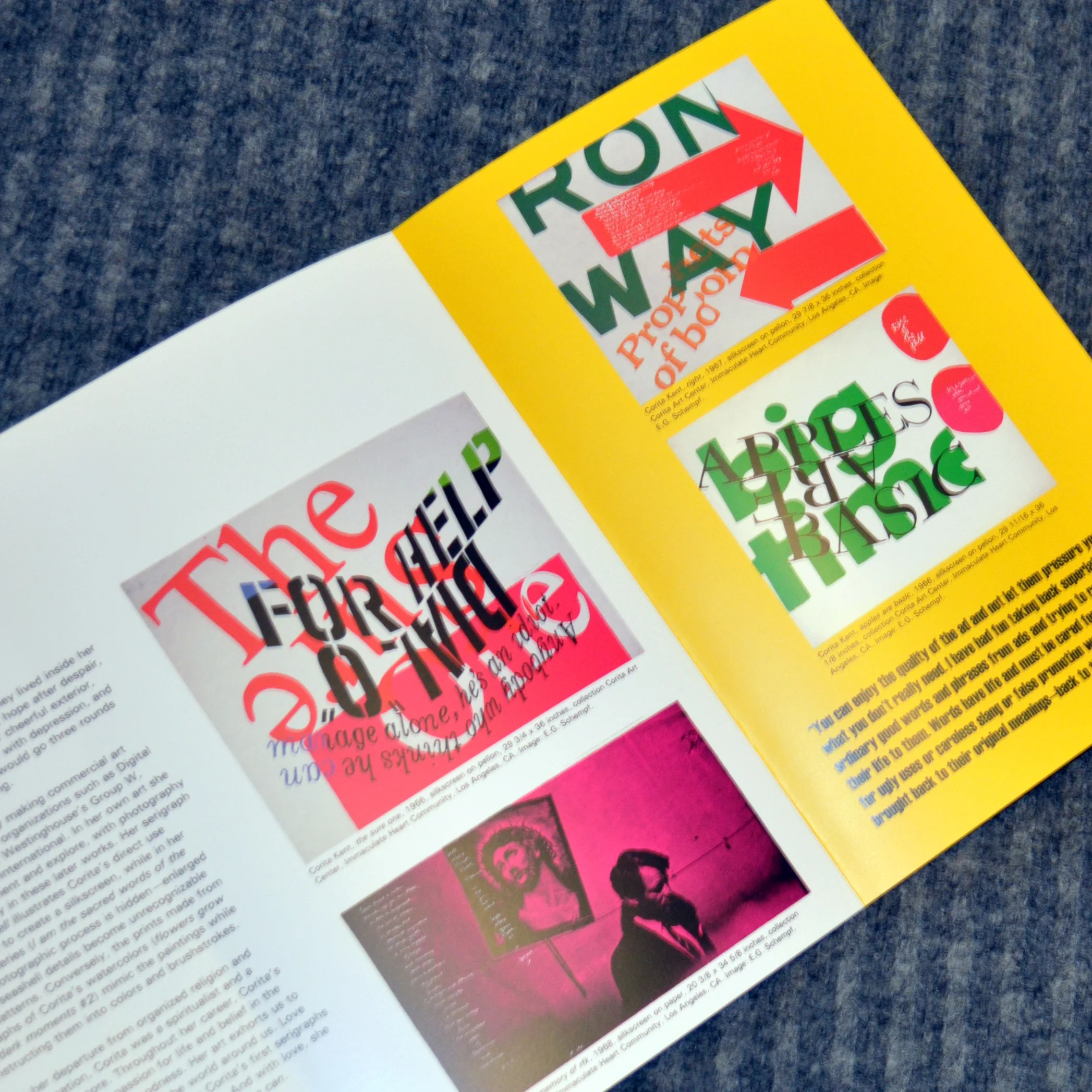
This exhibition featured top female artists. The works dealt with women's rights, the effects of war on women, and women fighting for peace.
Reactions from the show were uploaded to Youtube instantly. These 7 foot tall banners in 3 separate telescoping pieces. Fabric and telescoping pieced allowed for lightweight packing with maximum impact.
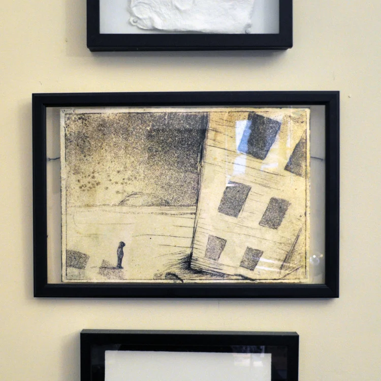
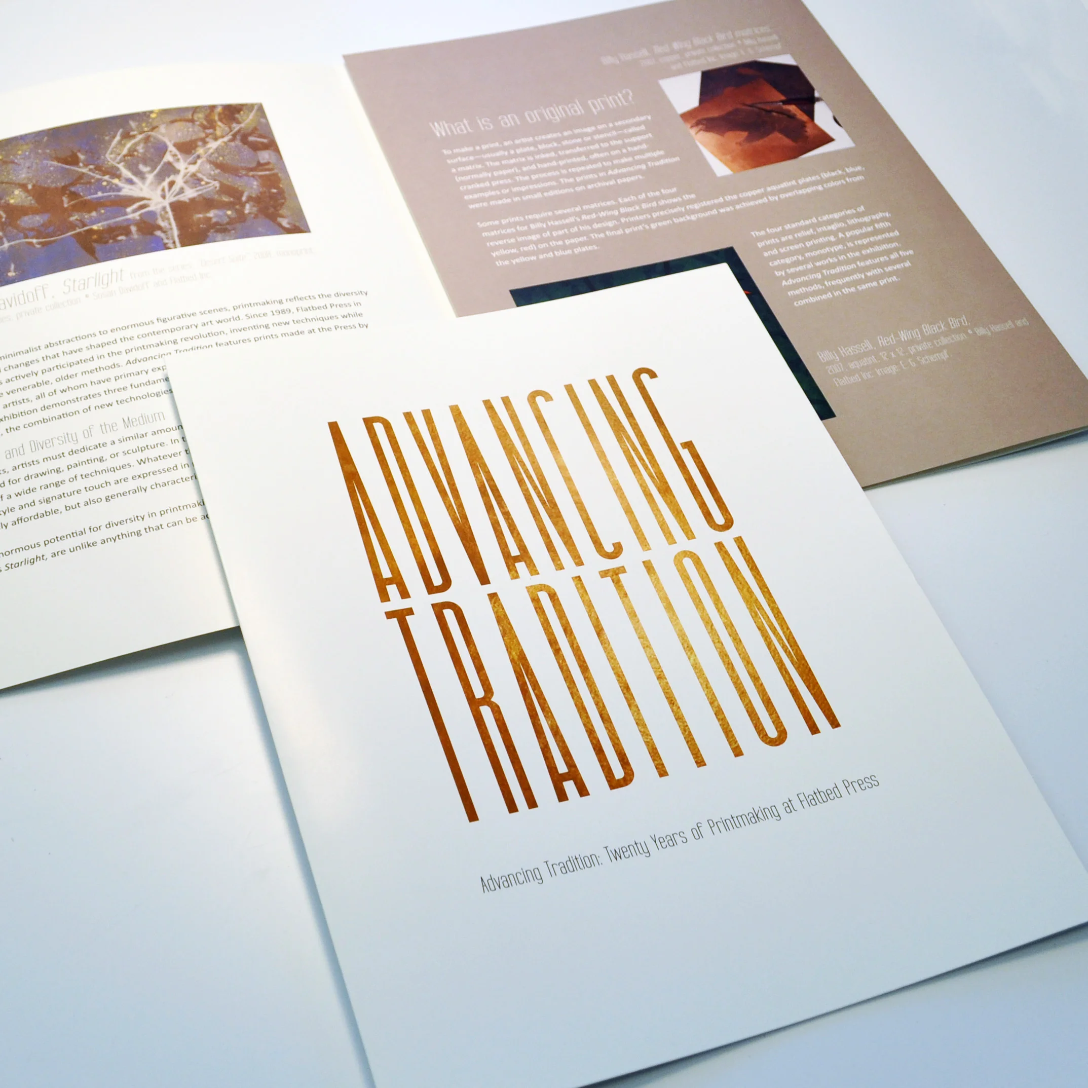
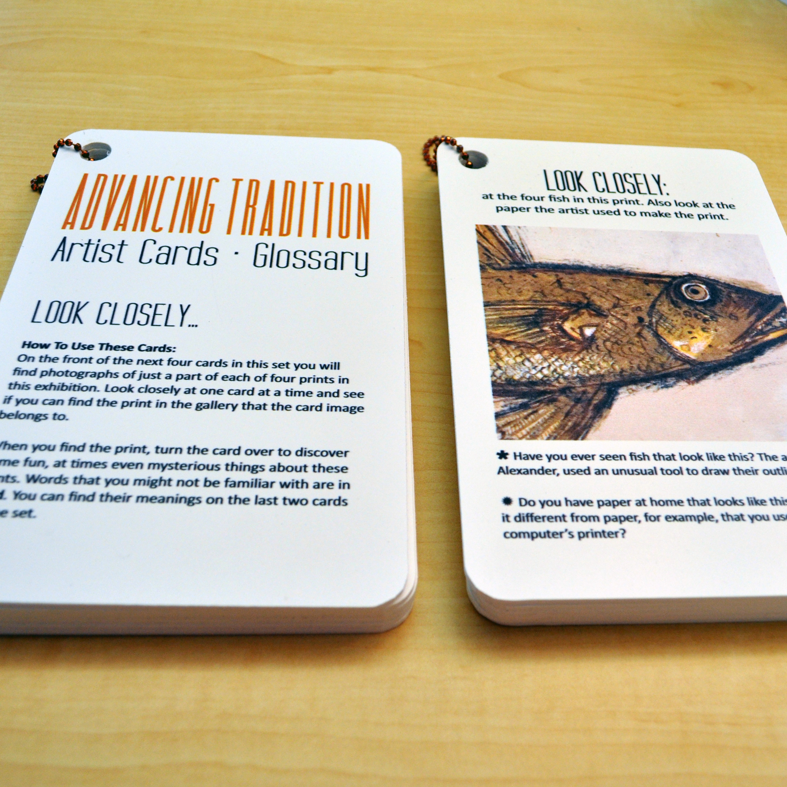
This exhibition featured printmaking artists from Flatbed Press in Austin, Texas.
Two sets of these cards were given to the venues to have in the gallery. Visitors could grab a set and while walking around, learn more about the subject matter or process.
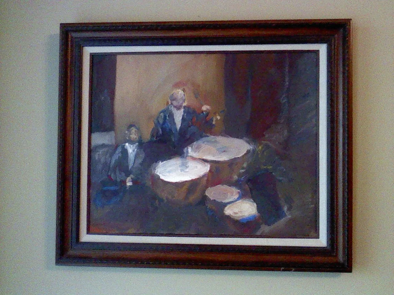
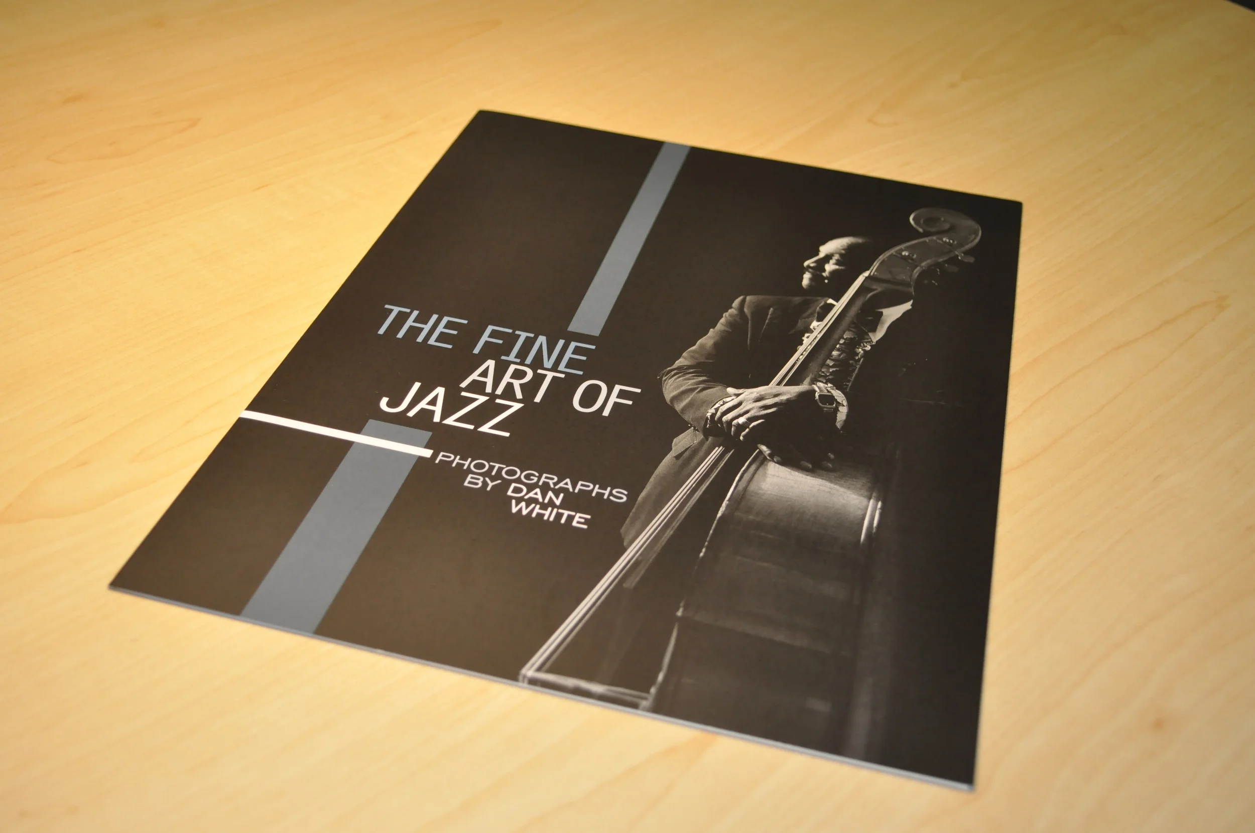
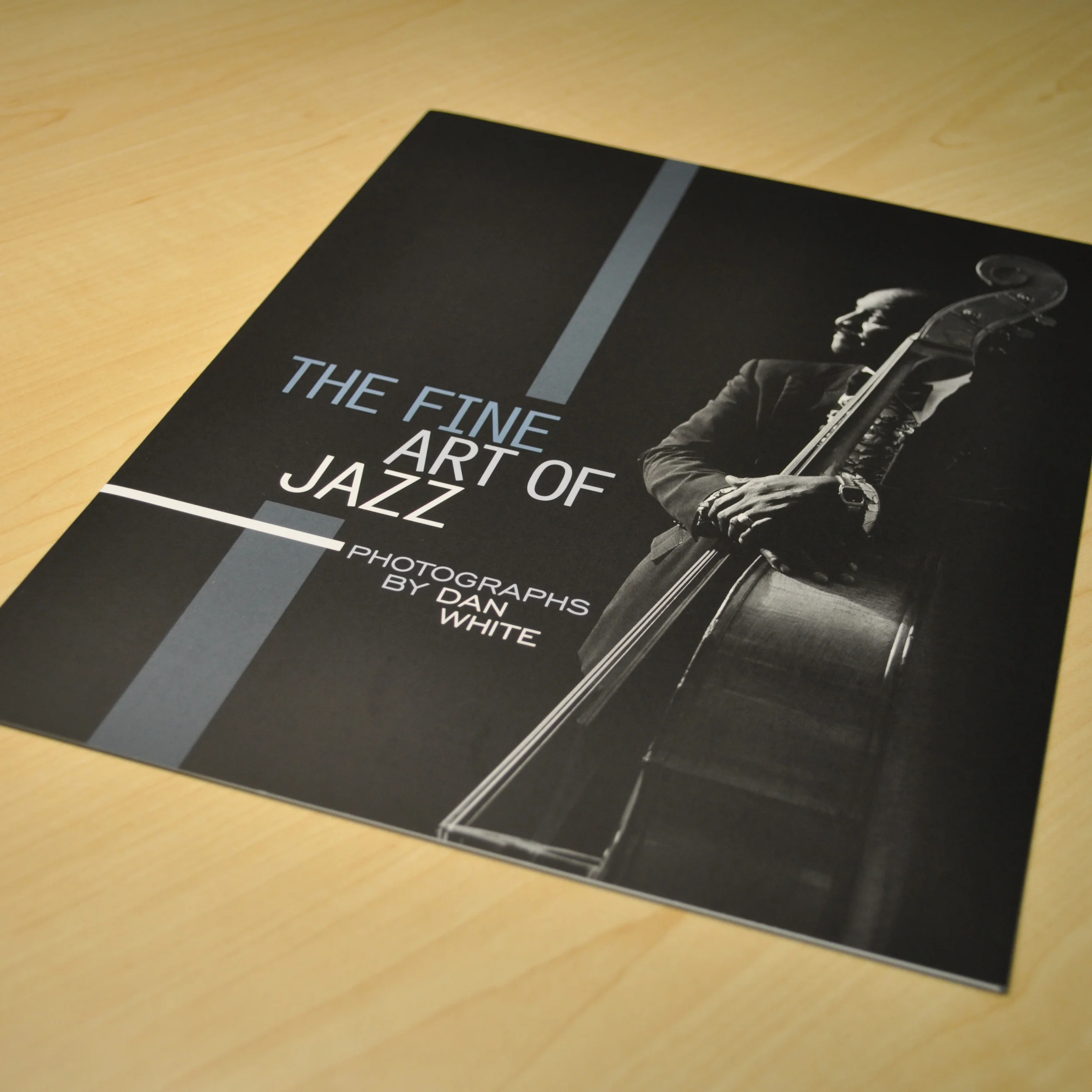
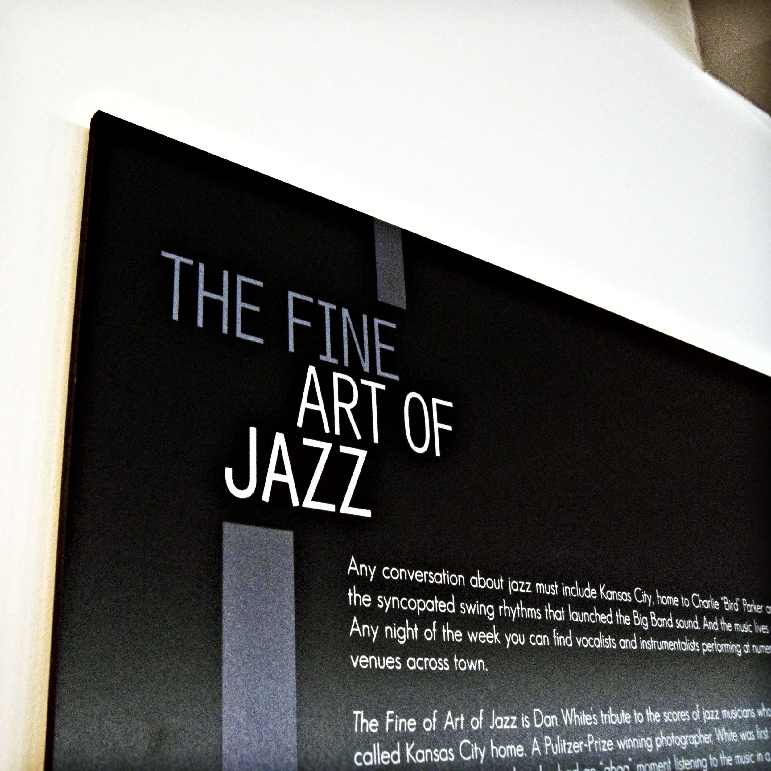
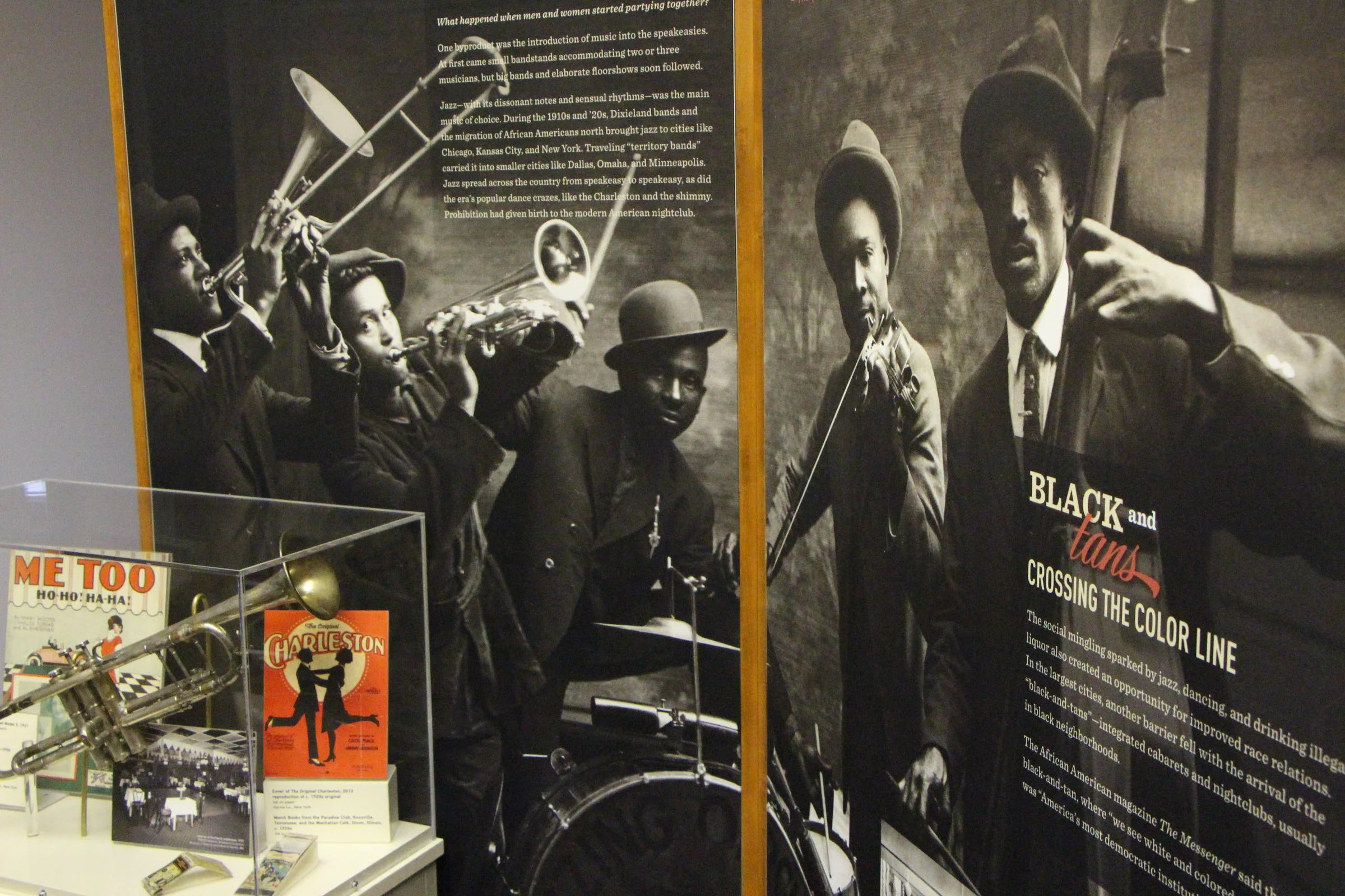
This exhibition features photography by Dan White. The artist's photos feature legendary Kansas City jazz musicians.
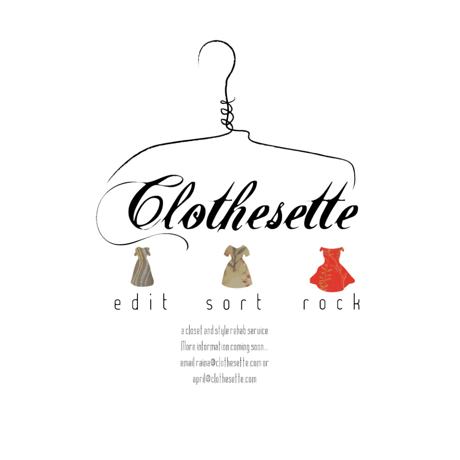
An short-lived experimental side business of my friend and mine.
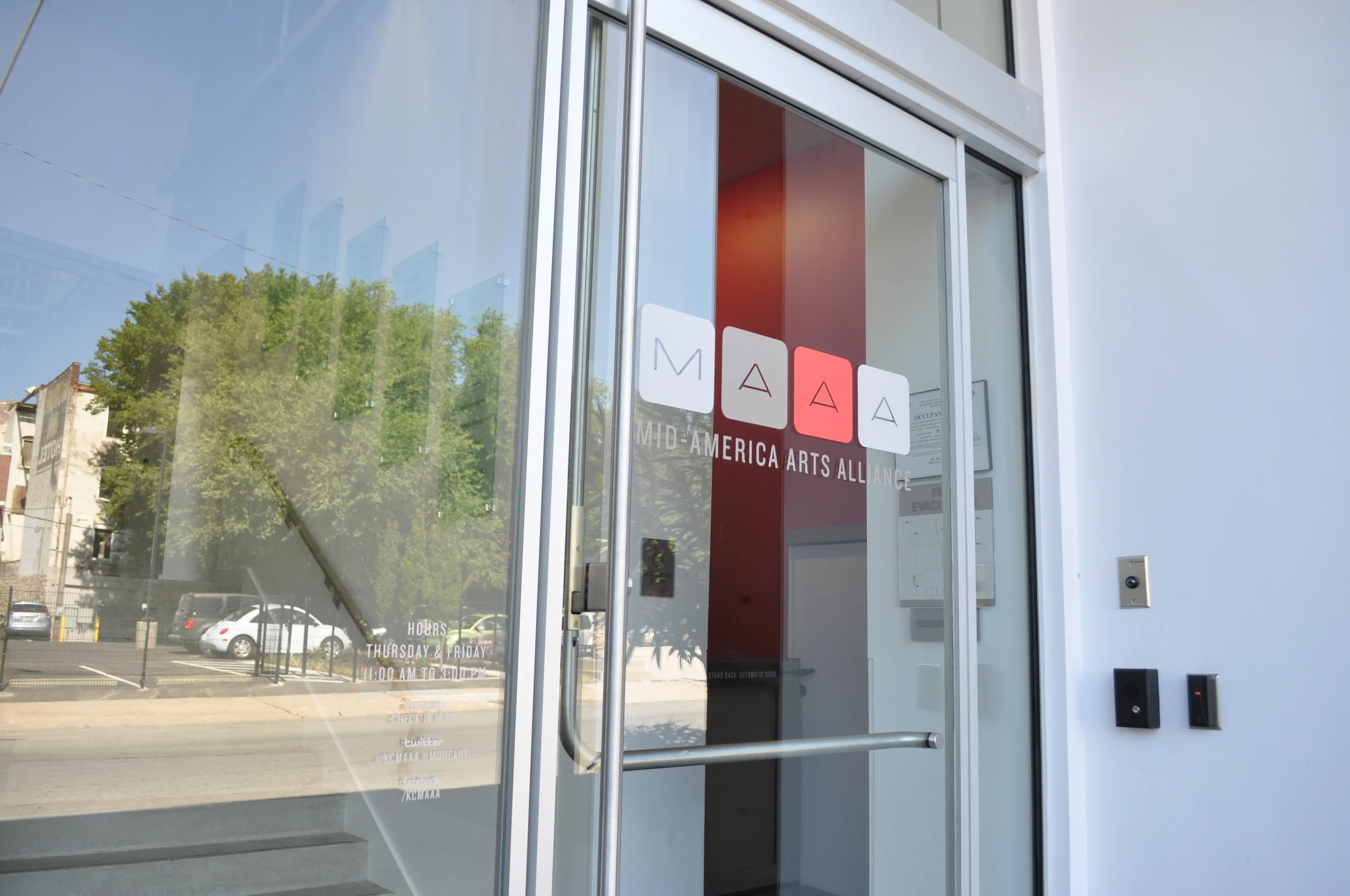
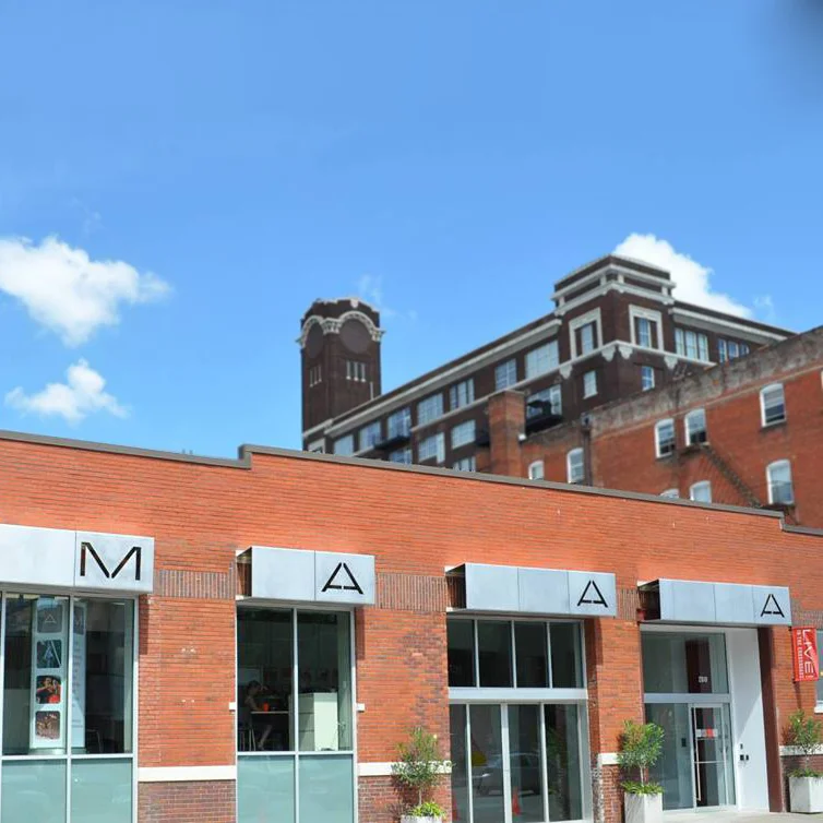
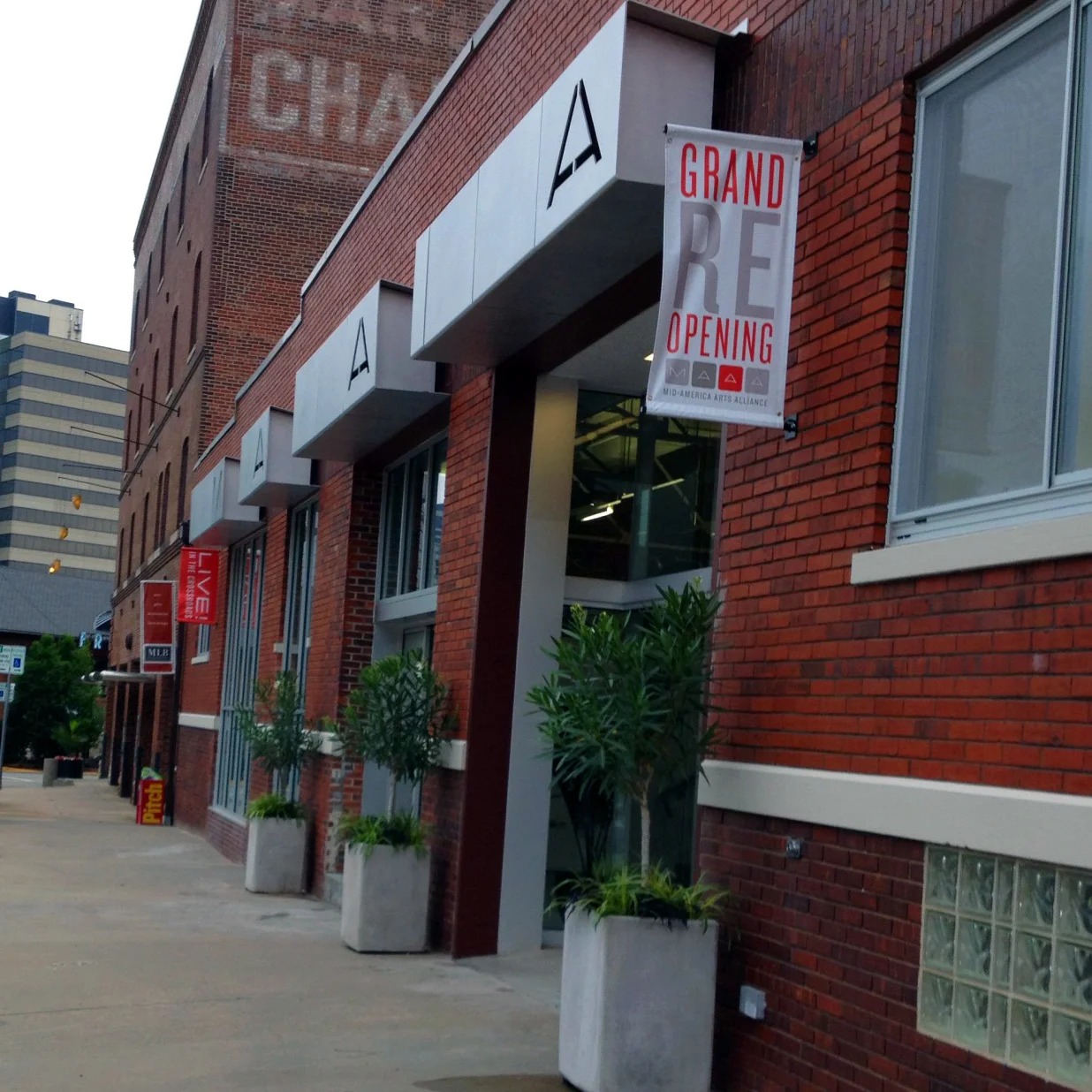
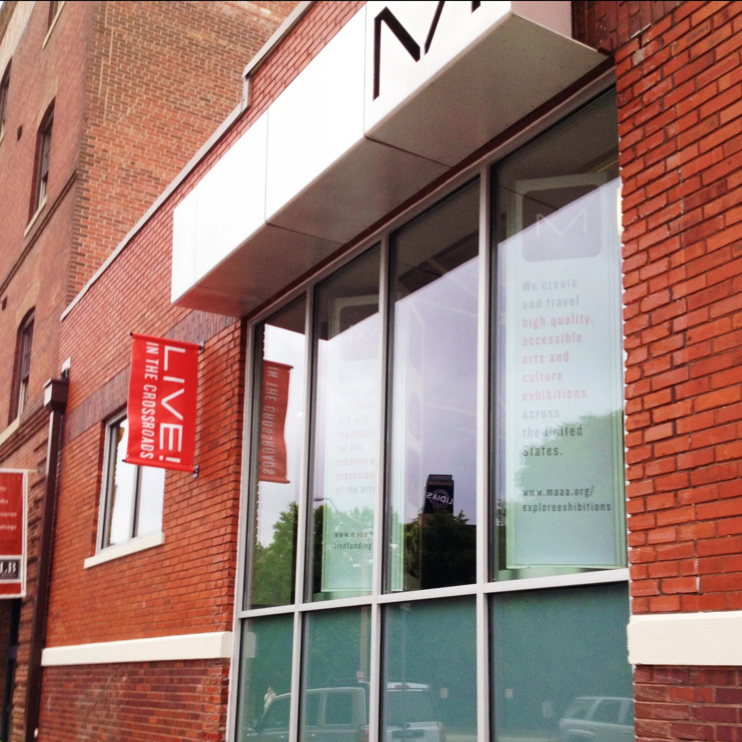
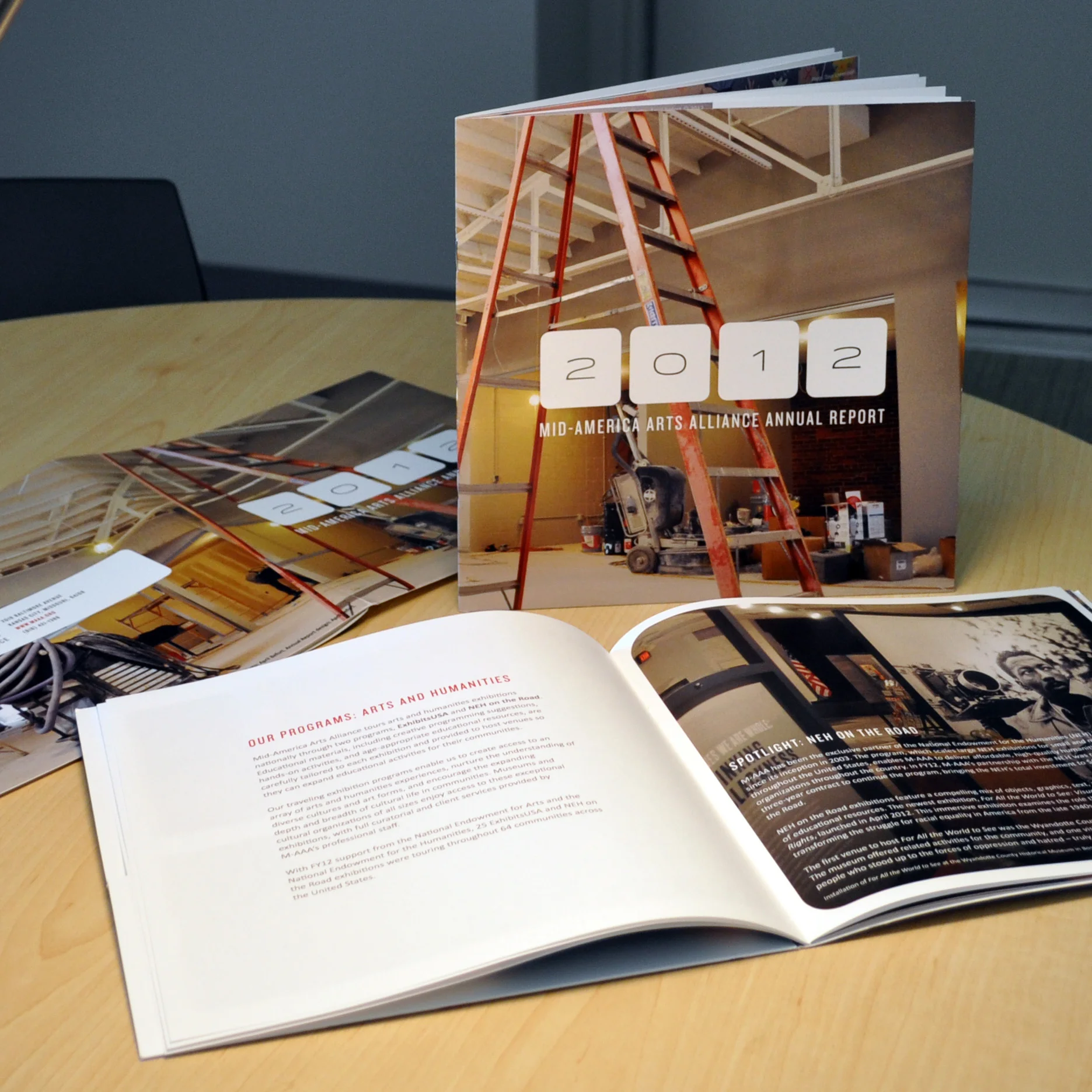
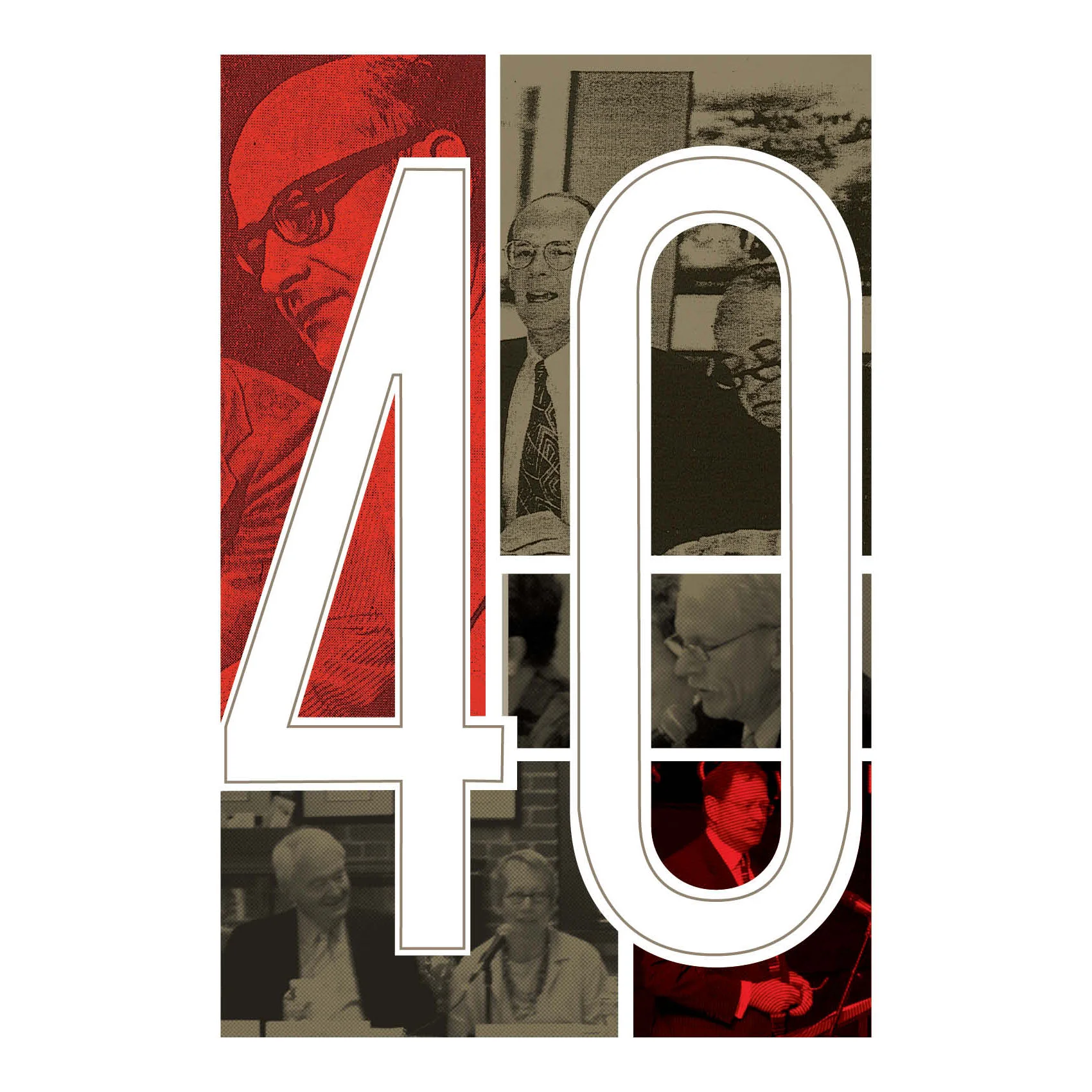
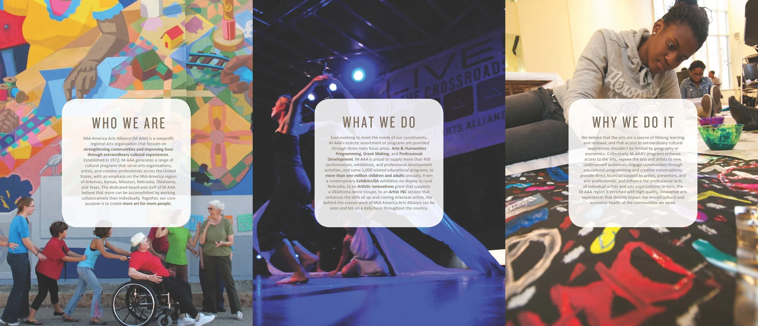
When Mid-America Arts Alliance began rennovation in 2012, I came to the marketing team with an idea, knowing that a full rebranding (which would involve messaging, new tagline, new logo and possible name change) is out of the question at the moment. My idea was to update our logo to match our new bright Mid-Century style facilities. This meant that I had to maintain cornerstones of our old logo: Red, each letter represented, the new name spelled out, 4 parts.
After about a year long process and 70 comps, this was the final outcome. The board was extremely impressed, even more so after they found out that we did not spend a dime on an agency or extra freelancers to help. I conducted surveys, had marketing team brainstorming sessions, and hundreds of hours of research.
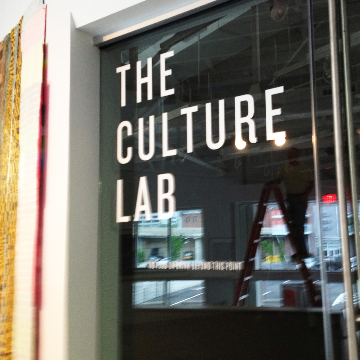
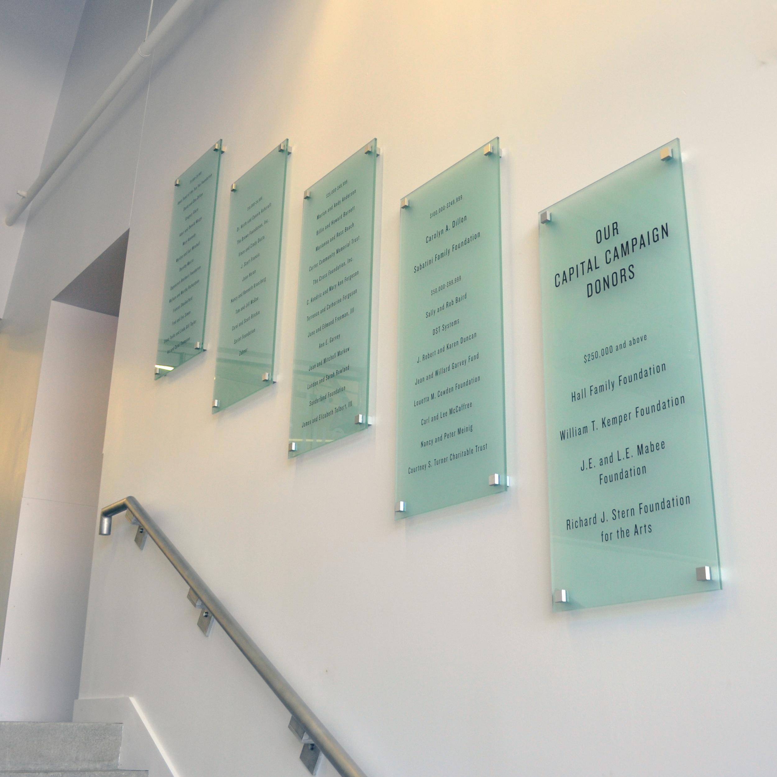
Glass by Westport Glass. Designed by me, executed by Midtown Signs.
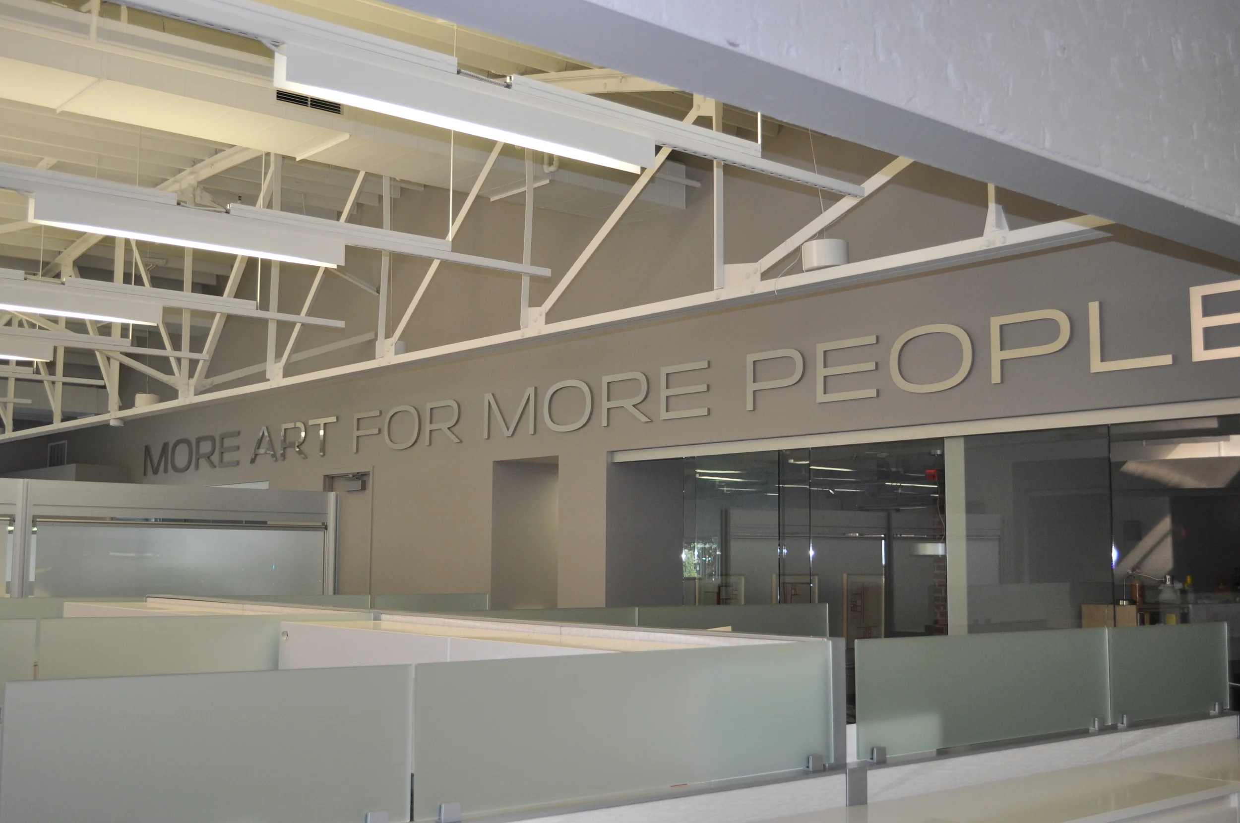
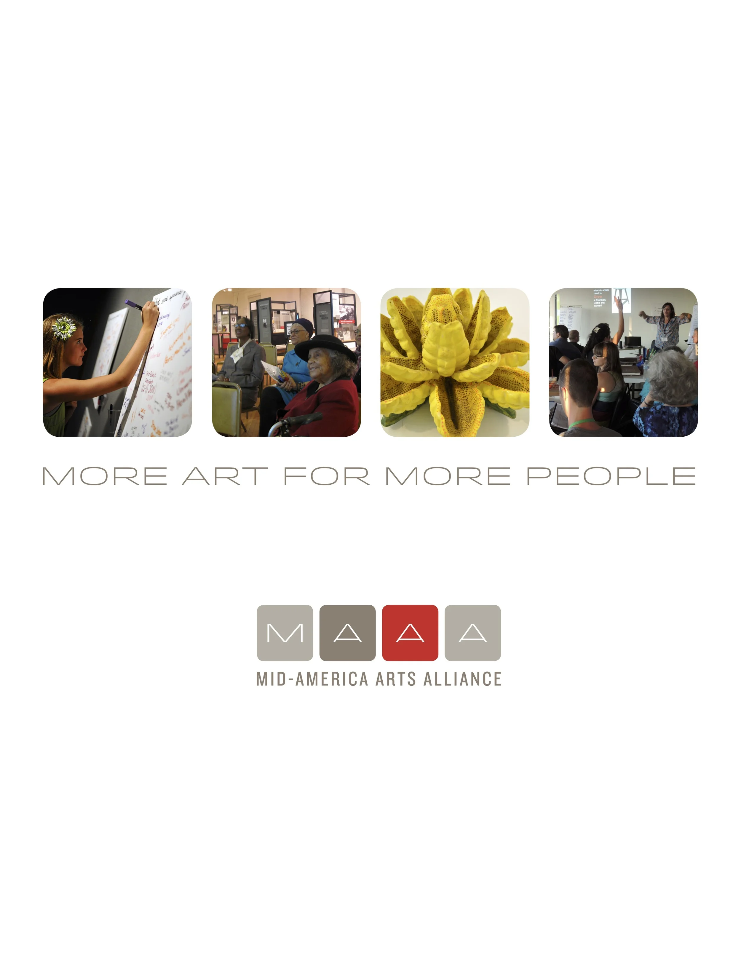
This piece is used for marketing and fundraising. It also launched the new brand and introduced our renovation project to the public.
Edited, art directed, and created by me.
Vinyl signage printed by Custom Color.
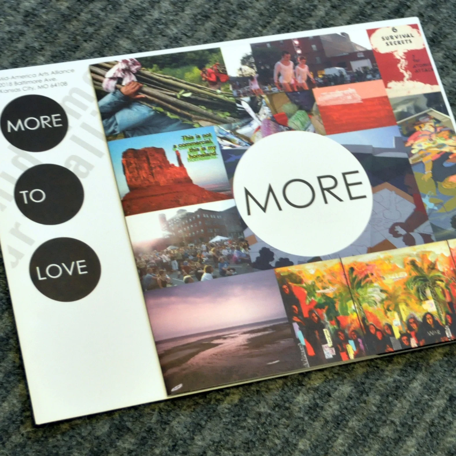
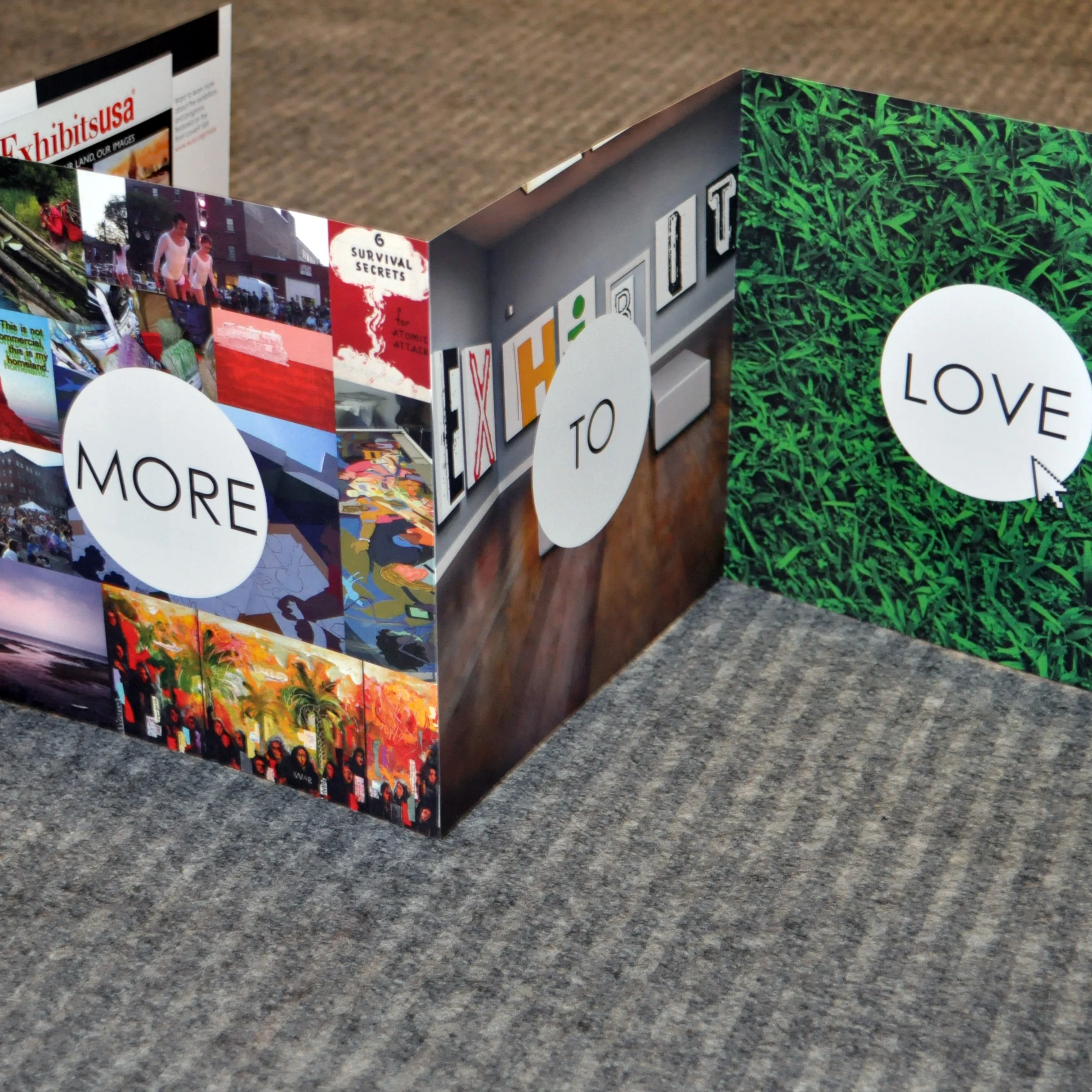
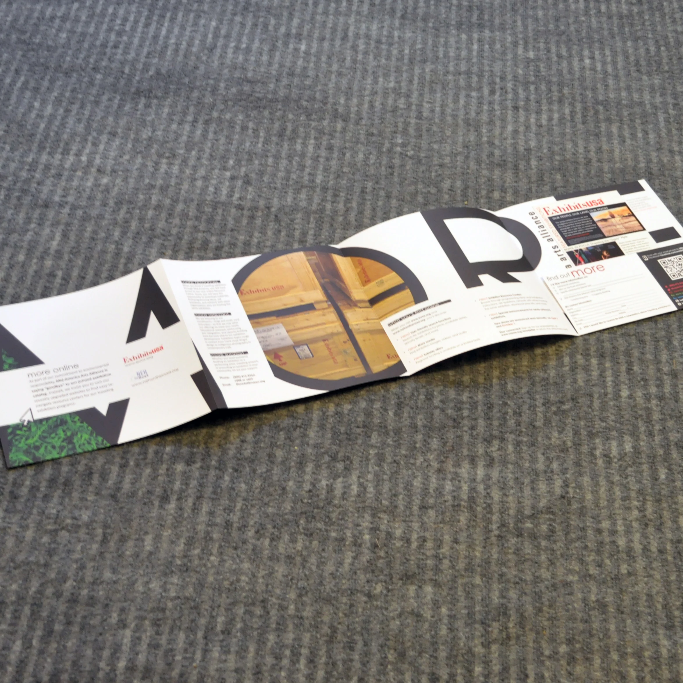
This marketing piece was to introduce new features on the exhibitions website. For environmental and budget reasons, the large catalog normally produced was retired. This piece explained the transition.
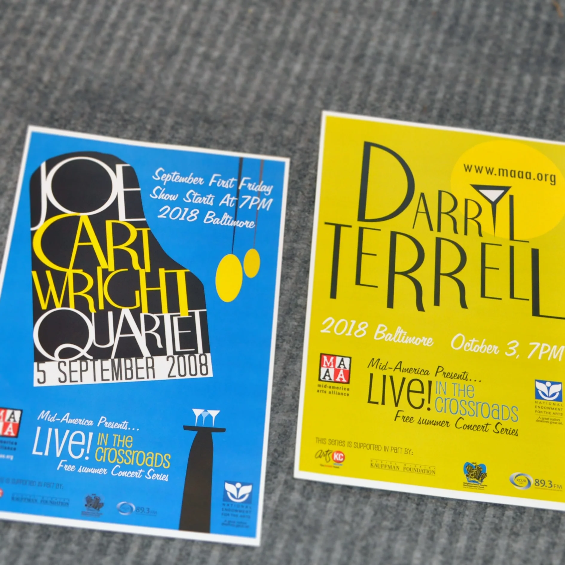
These posters pre-dated the M-AAA rebranding. The series used to have a Jazz focus and only happened in the summer.